
Baltic Wave Energy Group is a renewable energy company specialising in energy production, storage, and related services.
Project goal
Create a strong brand identity that accurately reflects Baltic Wave Energy Group’s core business: specialising in renewable energy projects across the Baltic region.
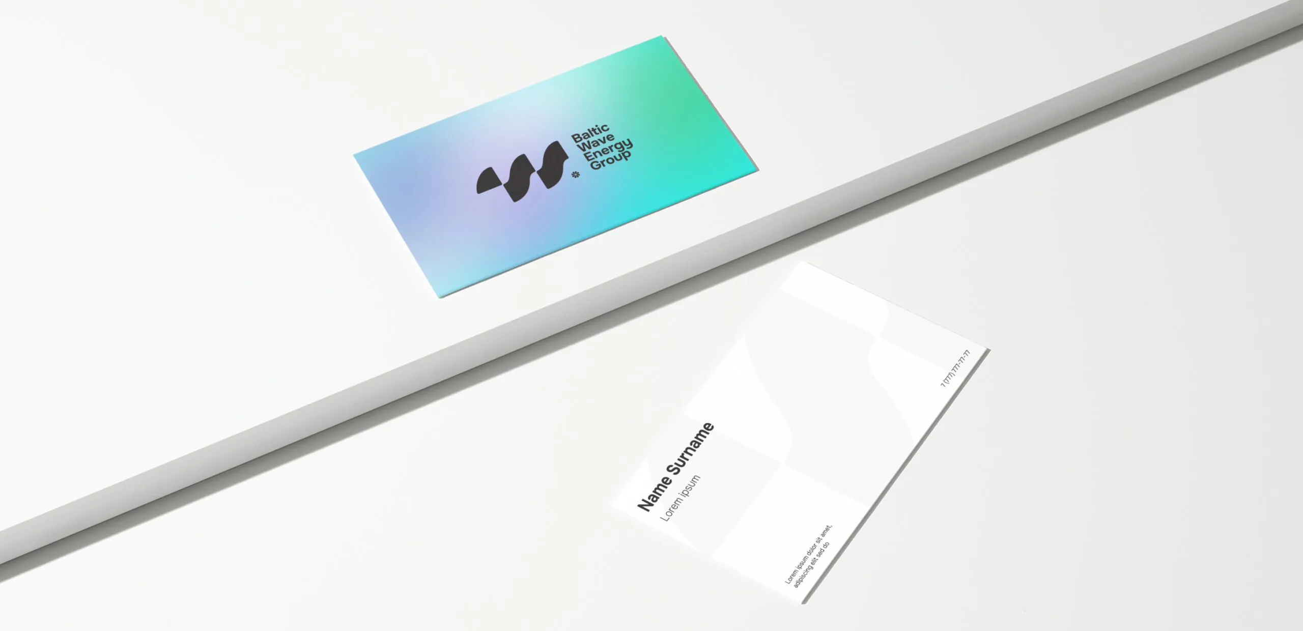
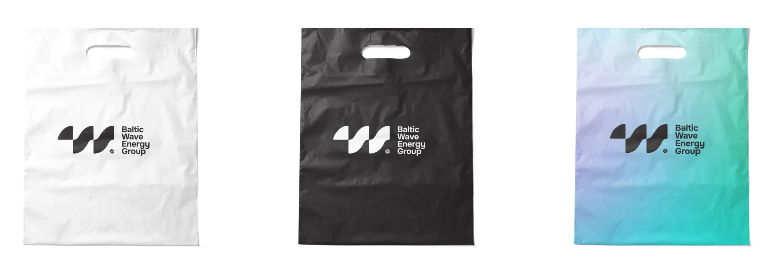
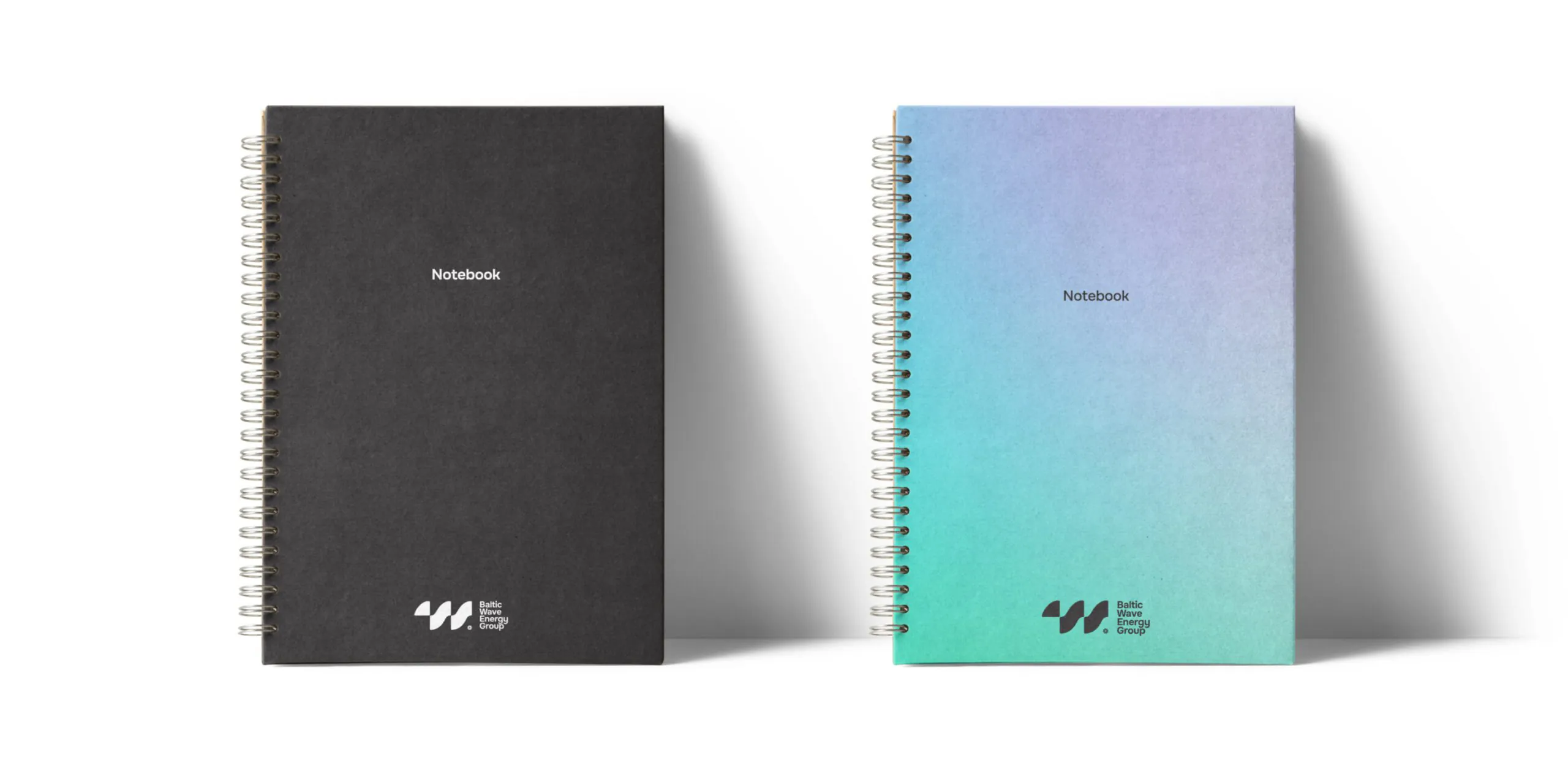
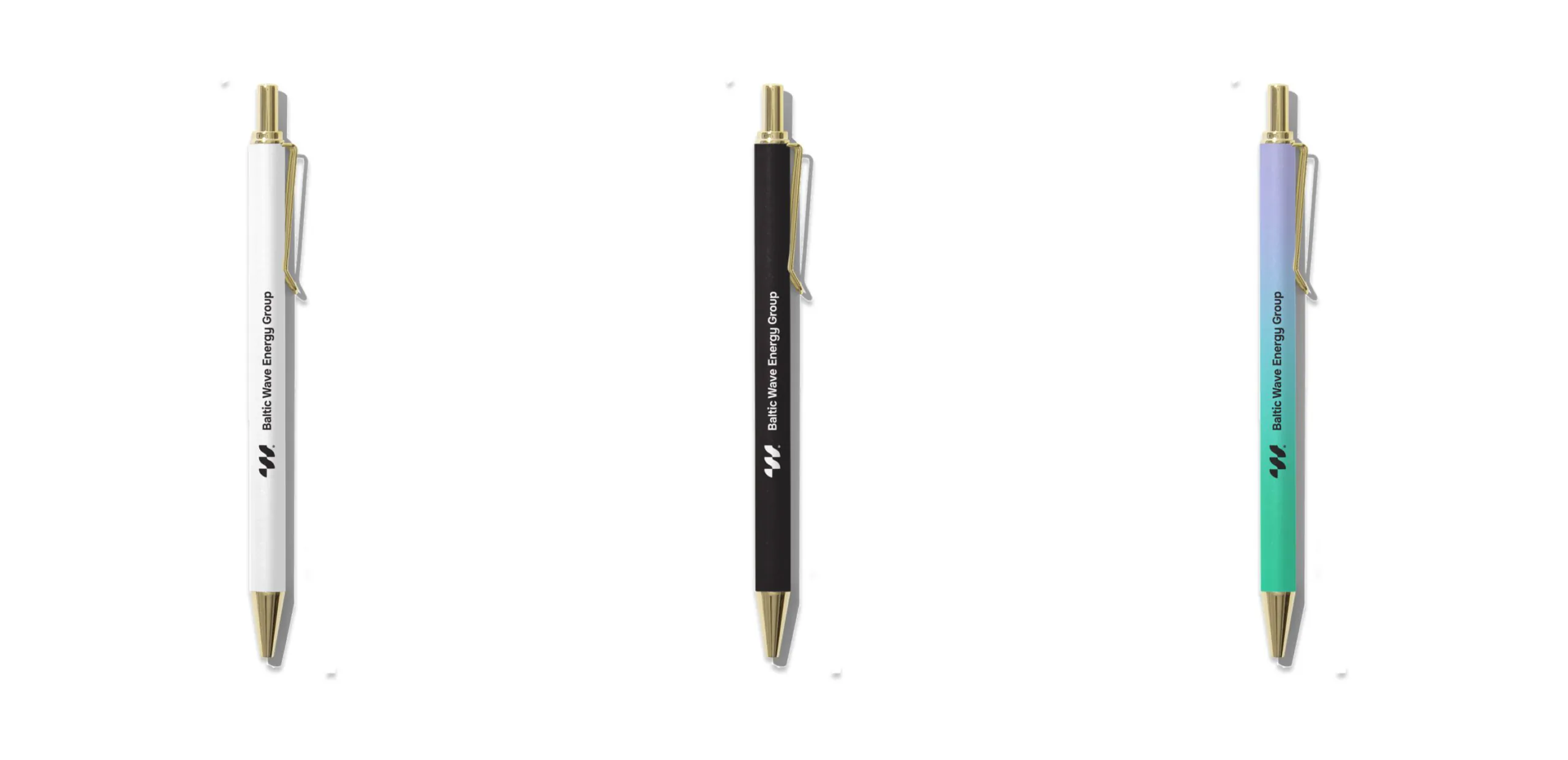
Desired identity elements: logo, typography, color palette and corporate identity merch.
Client input: following discussions on reference materials, the client has expressed a preference for:
- simple, clear design elements;
- a vibrant color palette using bright, pure colors;
- the potential use of gradients within the logo design.
Logo
The logo cleverly combines two key elements:
- The letter W: A subtle nod to “wave,” a core element of their business.
- A dynamic wave shape: This evokes the power and movement of waves, further emphasising their focus on wave energy.
Additional details are integrated seamlessly:
- A discrete element at the base: this incorporates icons representing wind, sun, and an engine, showcasing the broader range of renewable energy sources the holding works with.

Therefore, the logo clearly communicates the company’s message and values, while remaining versatile for various applications. The logo’s simplicity and clean lines make it easy to use and recognize in any context.
Typography
For optimal readability, the chosen typeface is Onest — a clean and modern sans-serif font. This font excels at displaying long texts clearly on any device screen, making it perfect for websites, presentations, and marketing materials.

Developed in December 2021 and updated in March 2023, Onest offers a neutral aesthetic and comes in seven styles. This provides versatility for different design needs. The font also supports Latvian, English, and Russian languages, ensuring clear communication across the Baltic region.
Color palette
A soft, clean, and smooth gradient color palette is proposed. The colors within the gradient palette reflect the holding’s activities and the imagery associated with them: energy, wind, and water.


Merch


Project’s team
Ilona Kardanova — Art Director
Tina Alieva — Graphic designer
Anna Spelova — Project Manager


 Return
  Share
Share 