Share
Share Emerald24 is a digital payments platform engineered to provide businesses and merchants worldwide with a modern and accessible alternative to traditional banking. Prioritizing efficiency and reliability, Emerald24 empowers global entrepreneurs with a secure and streamlined solution for international fund transfers, receipts, and currency exchange.
Objective
The client engaged our services to rebrand their visual identity. The existing brand, established for a significant period, presented a formal and strict aesthetic.
- The objective was to refresh the brand, making it more modern, approachable, and engaging, while retaining the necessary gravitas for the financial sector.
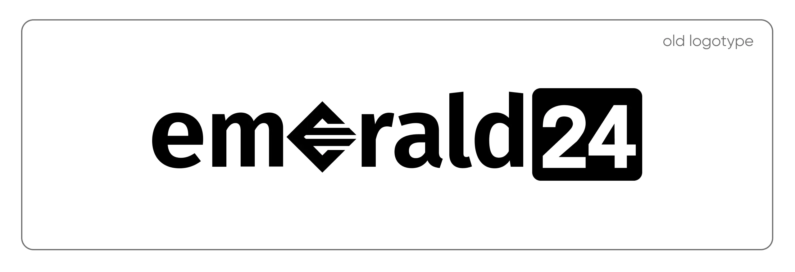
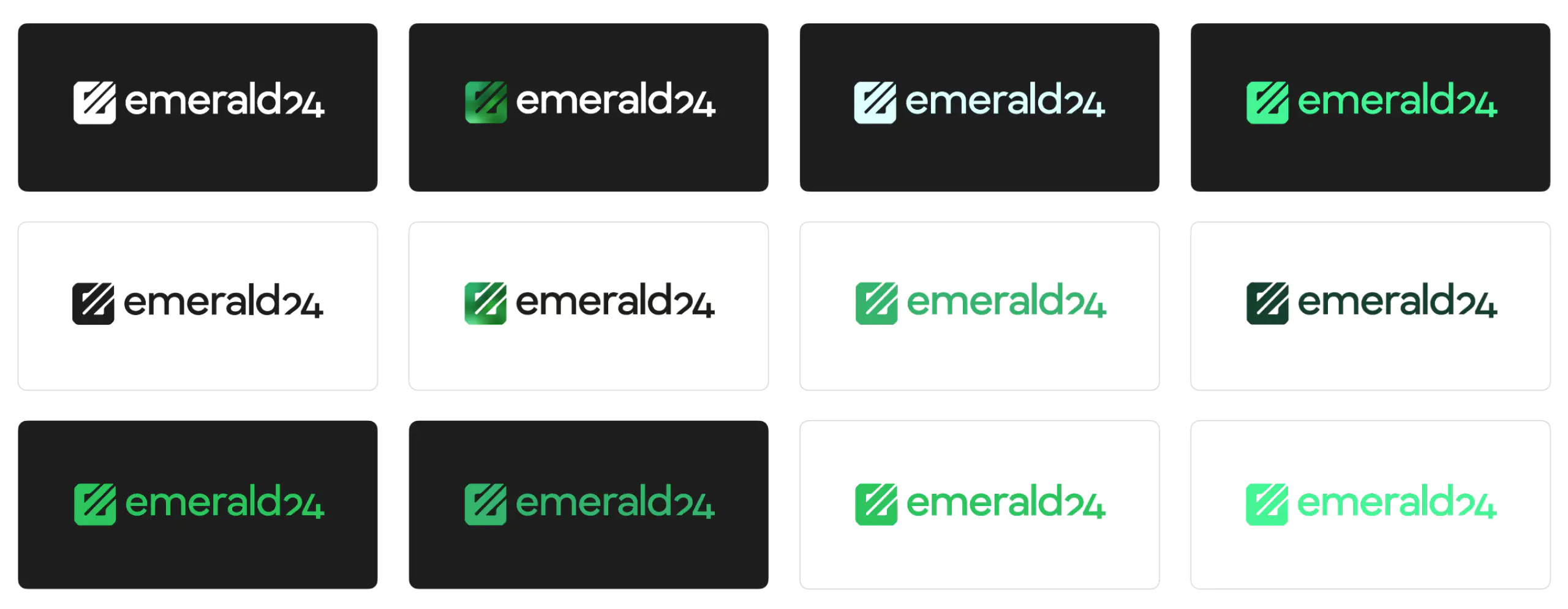
Logotype
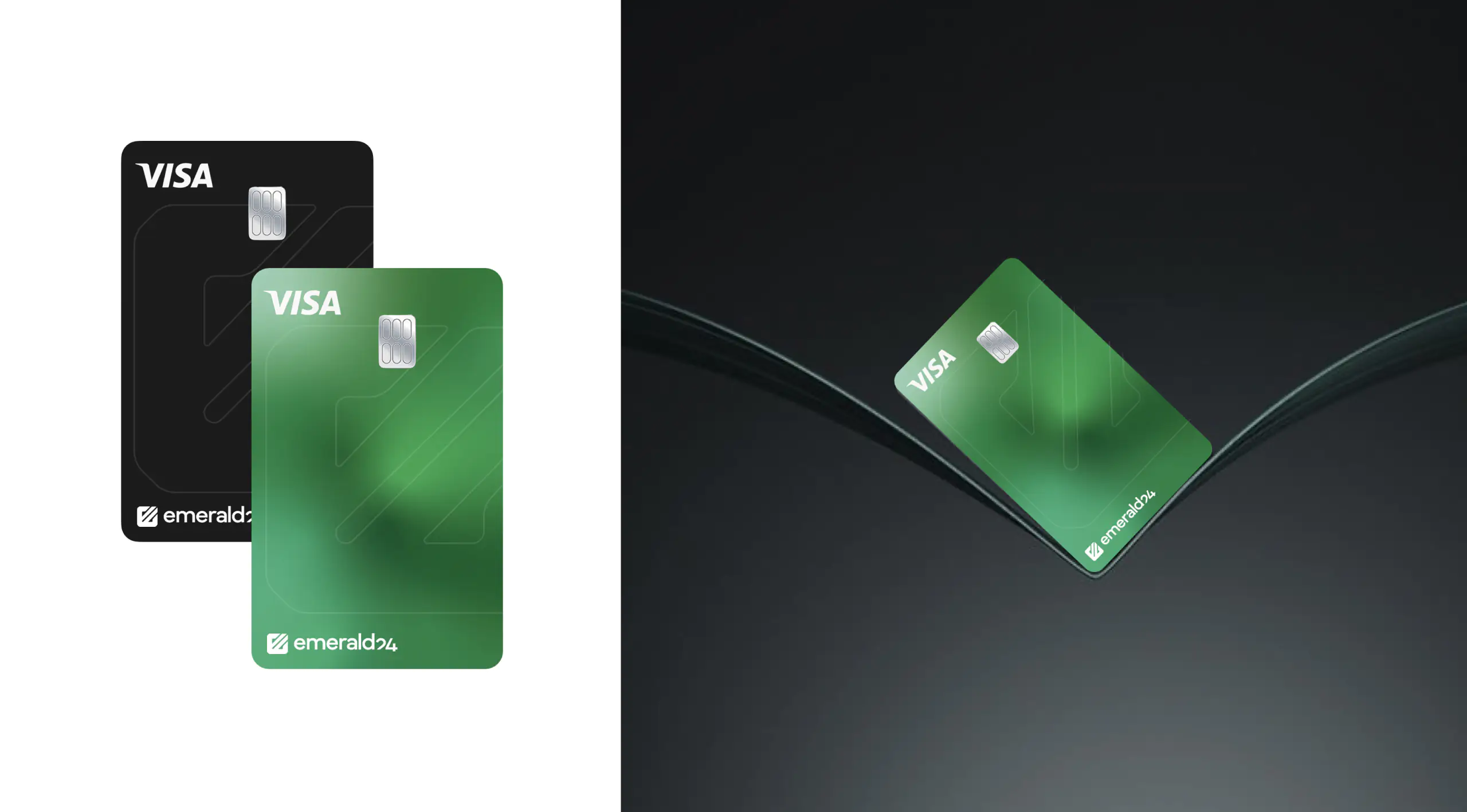
Emerald24’s existing logo held significant recognition among a broad audience. Furthermore, its core values of trust, innovation, and reliability remained central to the brand. The design challenge was to modernize the logo while preserving these key attributes. The updated design requirements included simplicity, directness, and memorability.
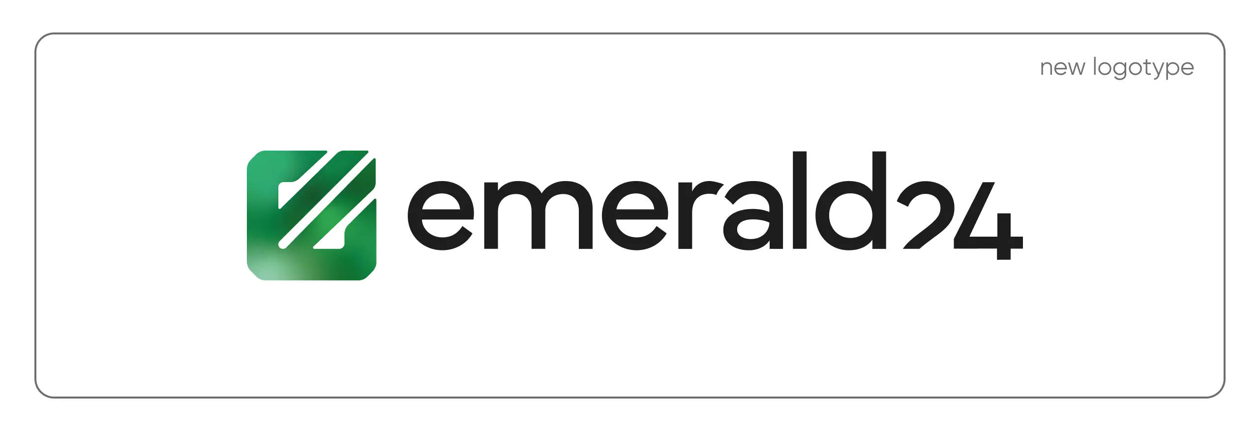
The text part of the updated Emerald24 logotype is designed with clean, modern typography to convey clarity and professionalism. Balanced letterforms reflect reliability and trust, while subtle geometric details suggest innovation and precision.
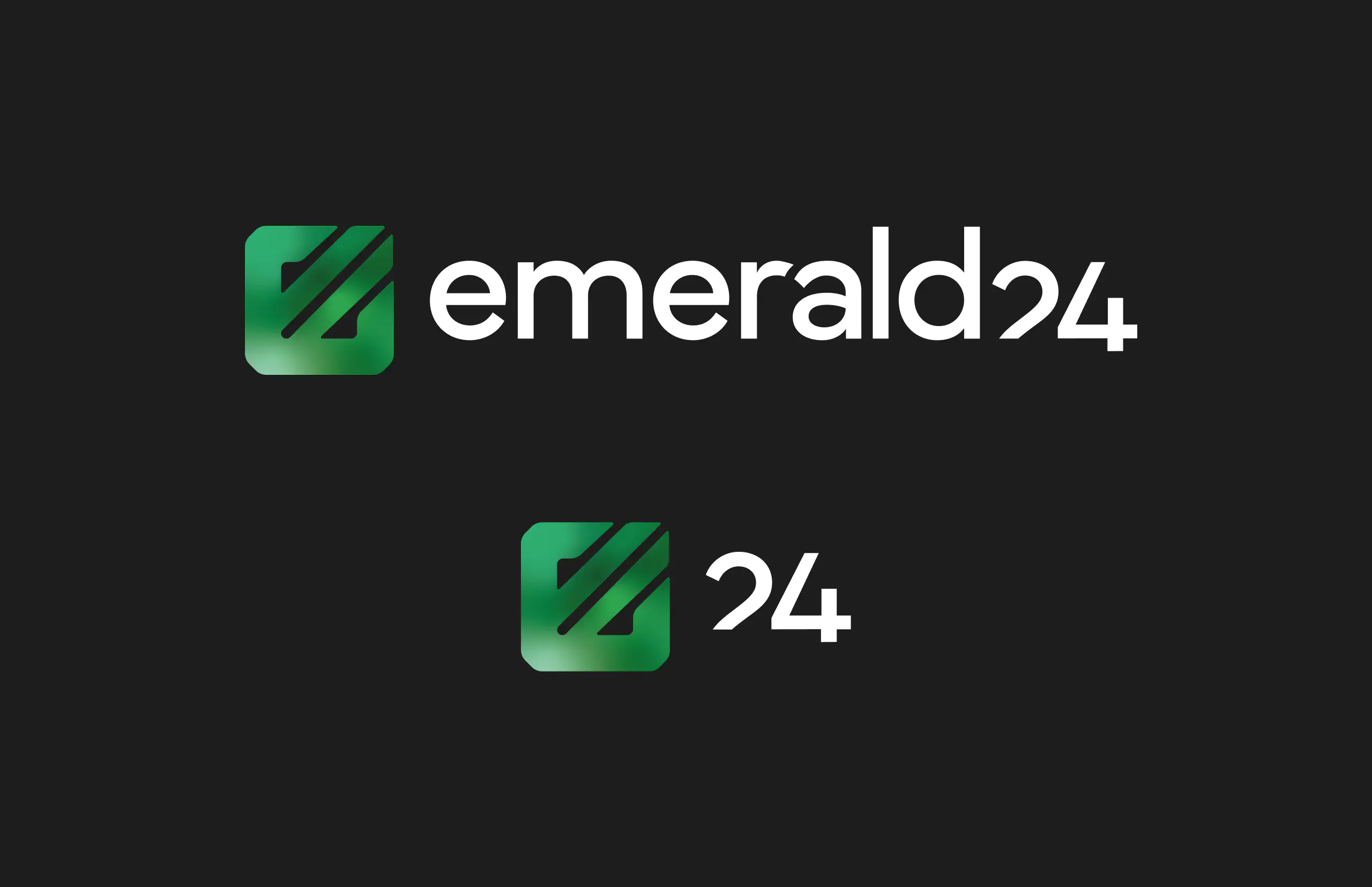
The icon seamlessly integrates with the overall brand identity, providing a distinctive visual element. The icon from the original logo was also transformed: it was mirrored, given rounded corners and softened shapes, and made adaptable for use with a gradient in the company’s corporate color palette.
Color Palette
Given the strong association between the brand name and the color green, the Emerald24 color palette needed to use green. The challenge laid in selecting appropriate emerald shades—moderately vibrant, unique, yet suitable for the financial sector and effective across various media, both digital and print.

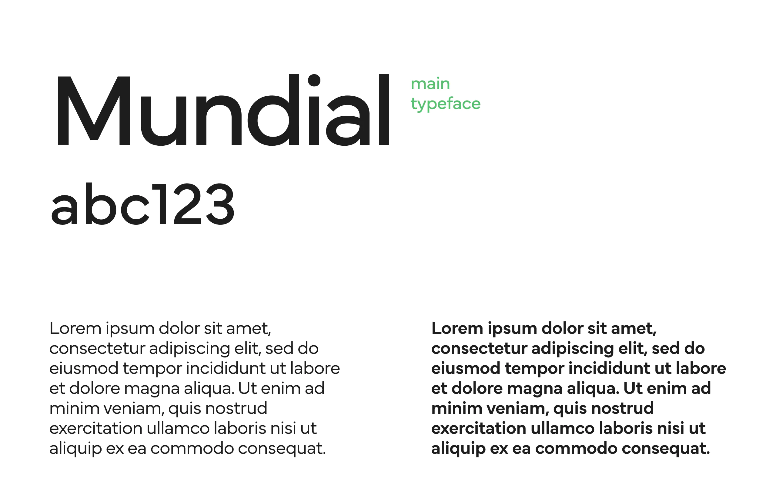
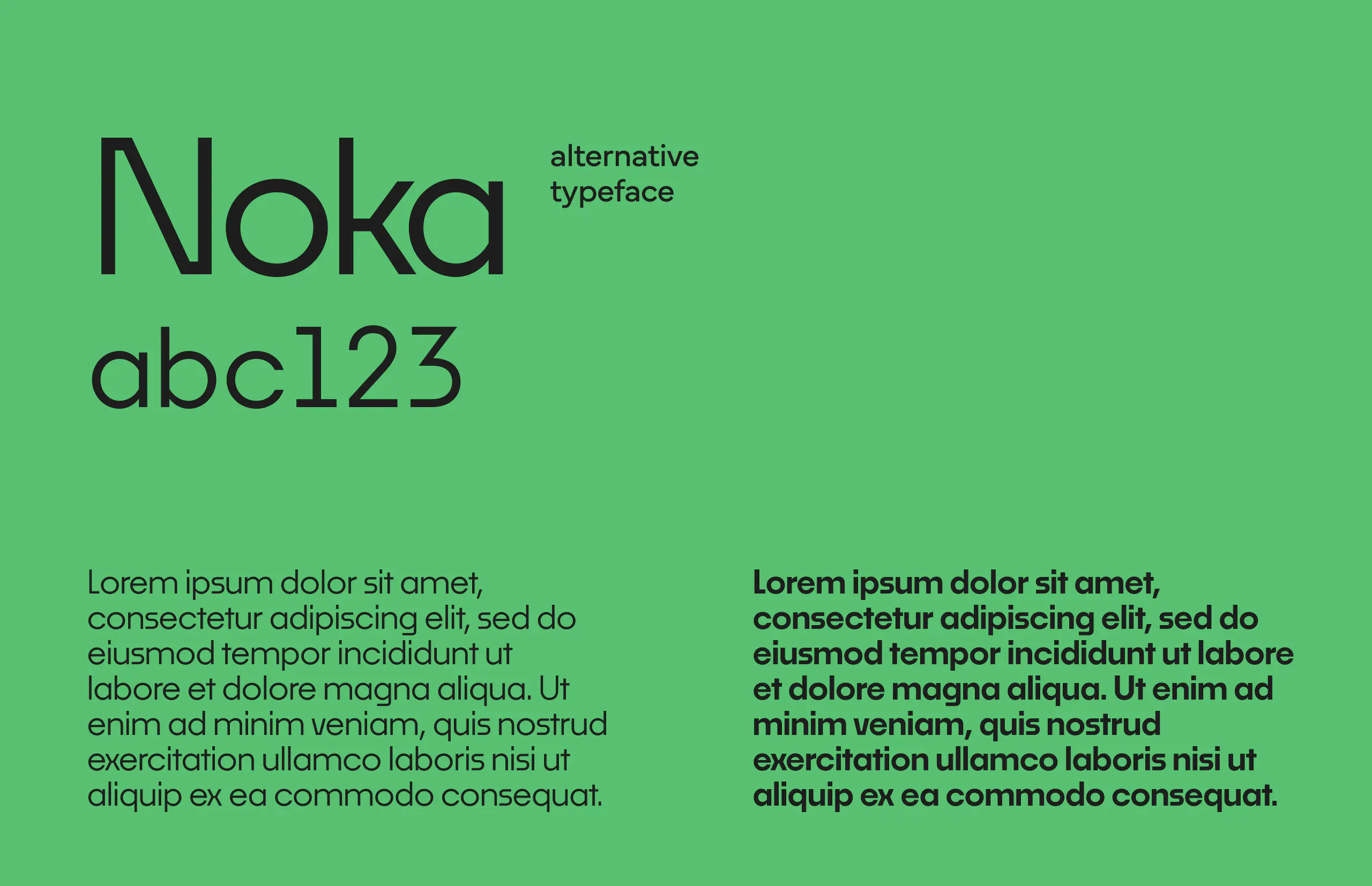
Typography
Typography is a cornerstone of Emerald24’s visual identity. Modern, clean fonts balance readability and sophistication. This ensures that brand communications, whether in print or digital formats, are always professional, clear and aligned with a commitment to excellence.
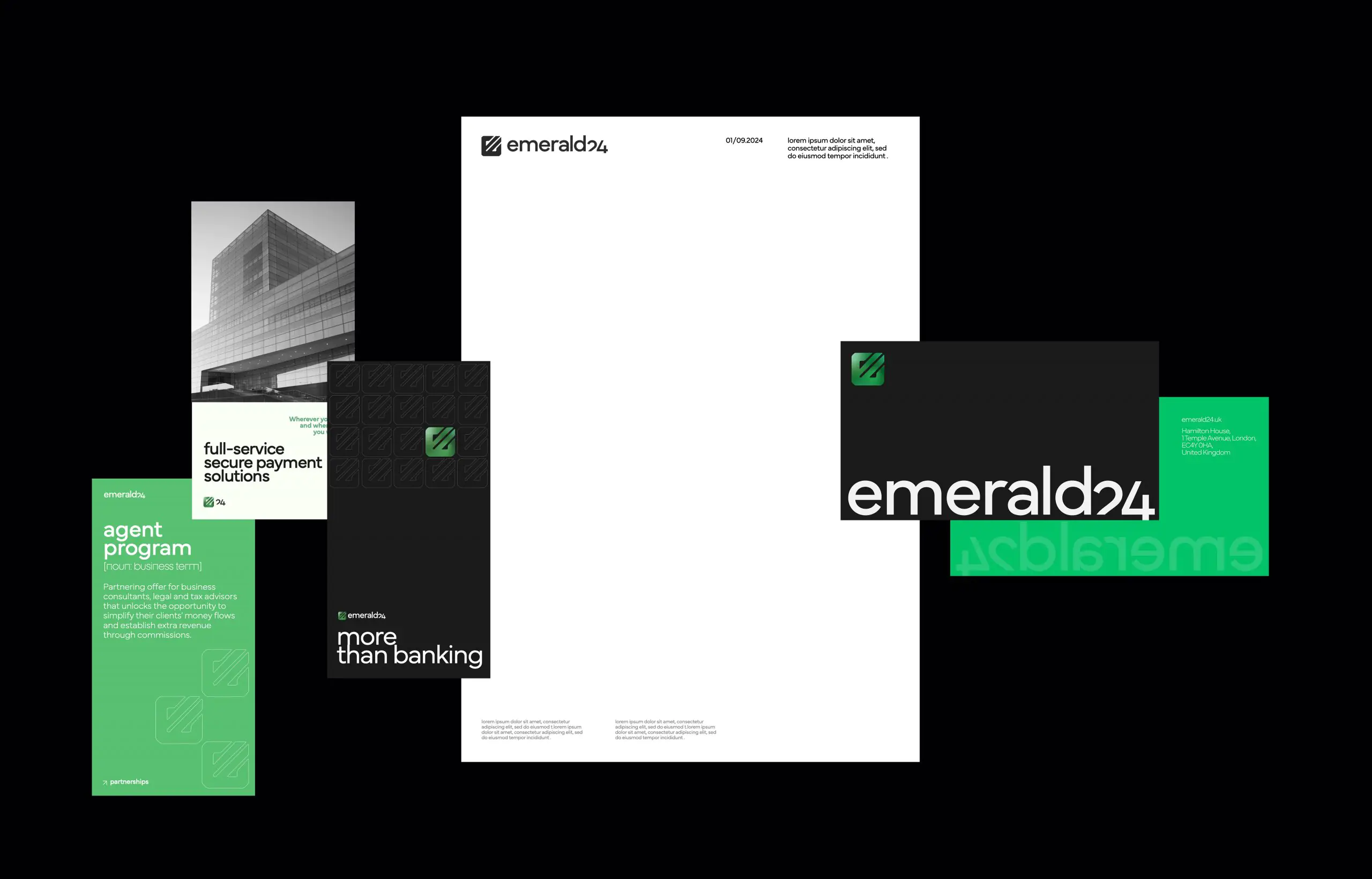
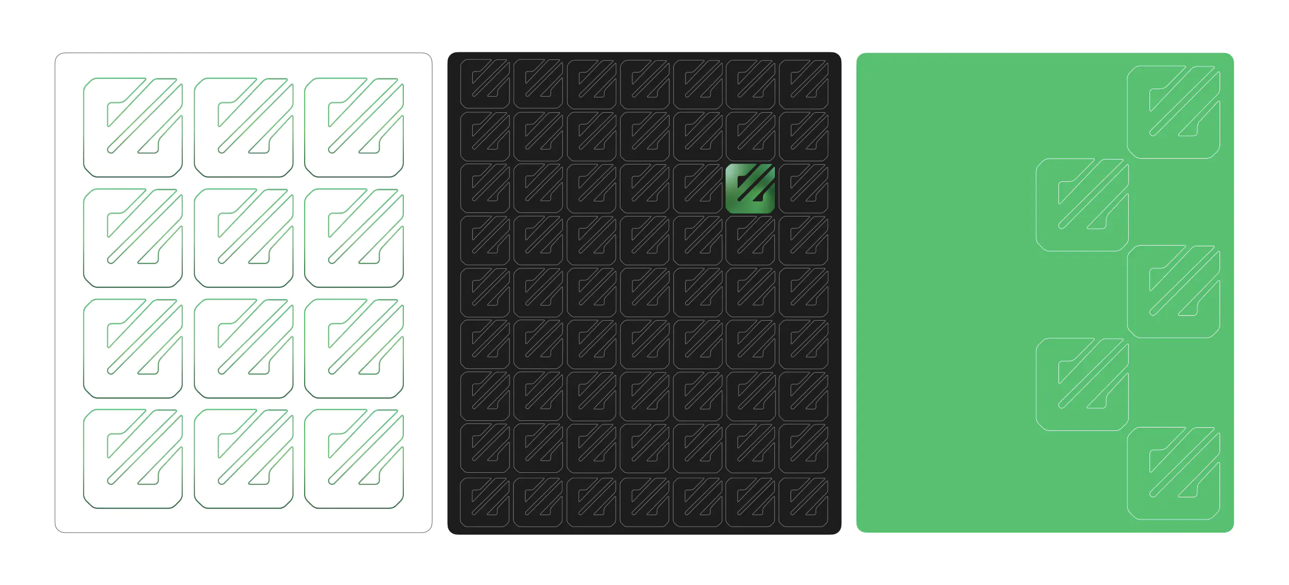
Pattern
The logo’s icon serves as the basis for the pattern across various Emerald24 media. It can be applied in solid color or branded gradient formats.
Imagery
At the client’s request, we developed detailed guidelines for image usage across media and produced a comprehensive brief for the team’s portrait photography. This resulted in several cohesive conceptual frameworks that aligned with the brand’s updated corporate style.
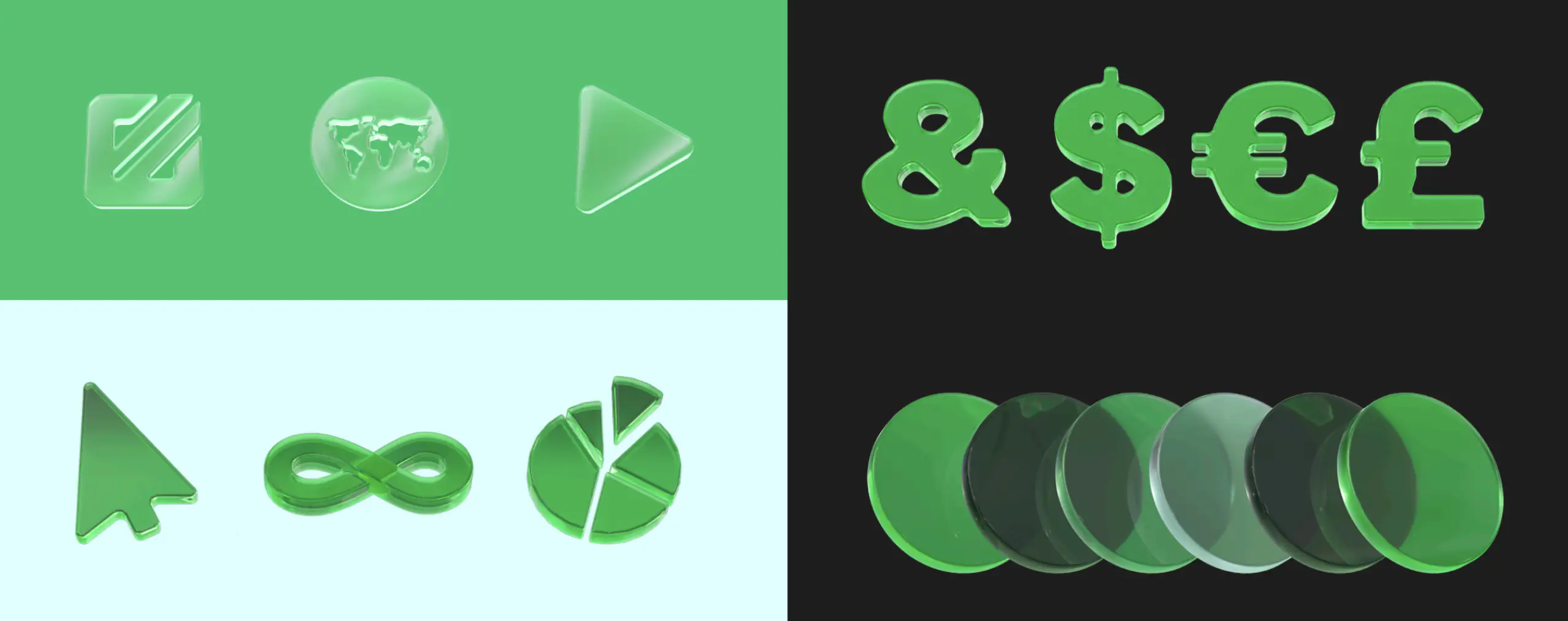
3D shapes
Furthermore, we developed 3D assets, suitable for use across all media including websites. These assets feature smooth, translucent surfaces, rendered as imagery to represent financial concepts.

Olegs Kravcenko
Emerald24 CEO
“Refreshing our visual identity was a key step for Emerald24 as we continue to evolve within the global financial landscape. The RocketScience team approached the project with deep understanding, positive energy, creativity, and precision.
They successfully modernised our logo and brand elements whilst carefully preserving the trust and reliability our clients associate with us. Their considered design choices—from the typography and colour palette to the detailed imagery guidelines—fully met our expectations.
Throughout the process, RocketScience demonstrated professionalism, meticulous attention to detail, and a genuine sense of partnership. Thanks to them, we now have a vibrant, future-ready brand that perfectly reflects who we are today and where we are heading”.