Share
Share Dudoxx is a health-tech startup based in Hamburg, Germany. The founding team brings together senior physicians, academics, AI specialists, and software engineers, united by a mission to drive social impact and reshape digital health—both nationally and globally. Recently, Dudoxx was recognized as a Deutsche Telekom partner, marking an important milestone in its growth journey.
Objective
The goal of this collaboration was to transform a fast-growing health-tech startup into a visually confident, modern, and instantly recognizable brand—both in Germany and globally.
- Refresh the existing logo and signature blue while preserving their original essence.
- Develop a cohesive, modern, trustworthy, and dynamic visual identity across all brand touchpoints.
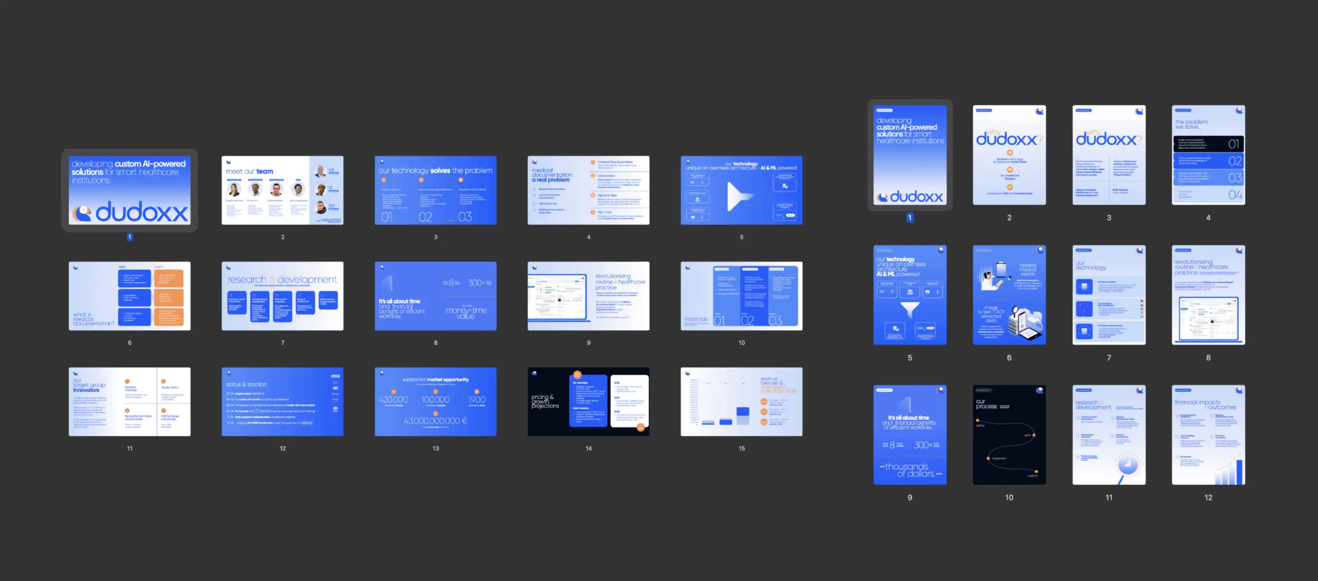
- Redesign key corporate materials—pitch deck, commercial flyer, exhibition flyer—making them polished, persuasive, and memorable.
Our approach
We began with an in-depth workshop to understand the client’s vision. Together, we explored their preferences, admired brands, current design trends, and analyzed competitors to define the brand’s tone, personality, and desired associations.
This helped us shape a clear sense of direction—understanding how the brand speaks to its audience, and what kind of feelings and associations it aims to create.
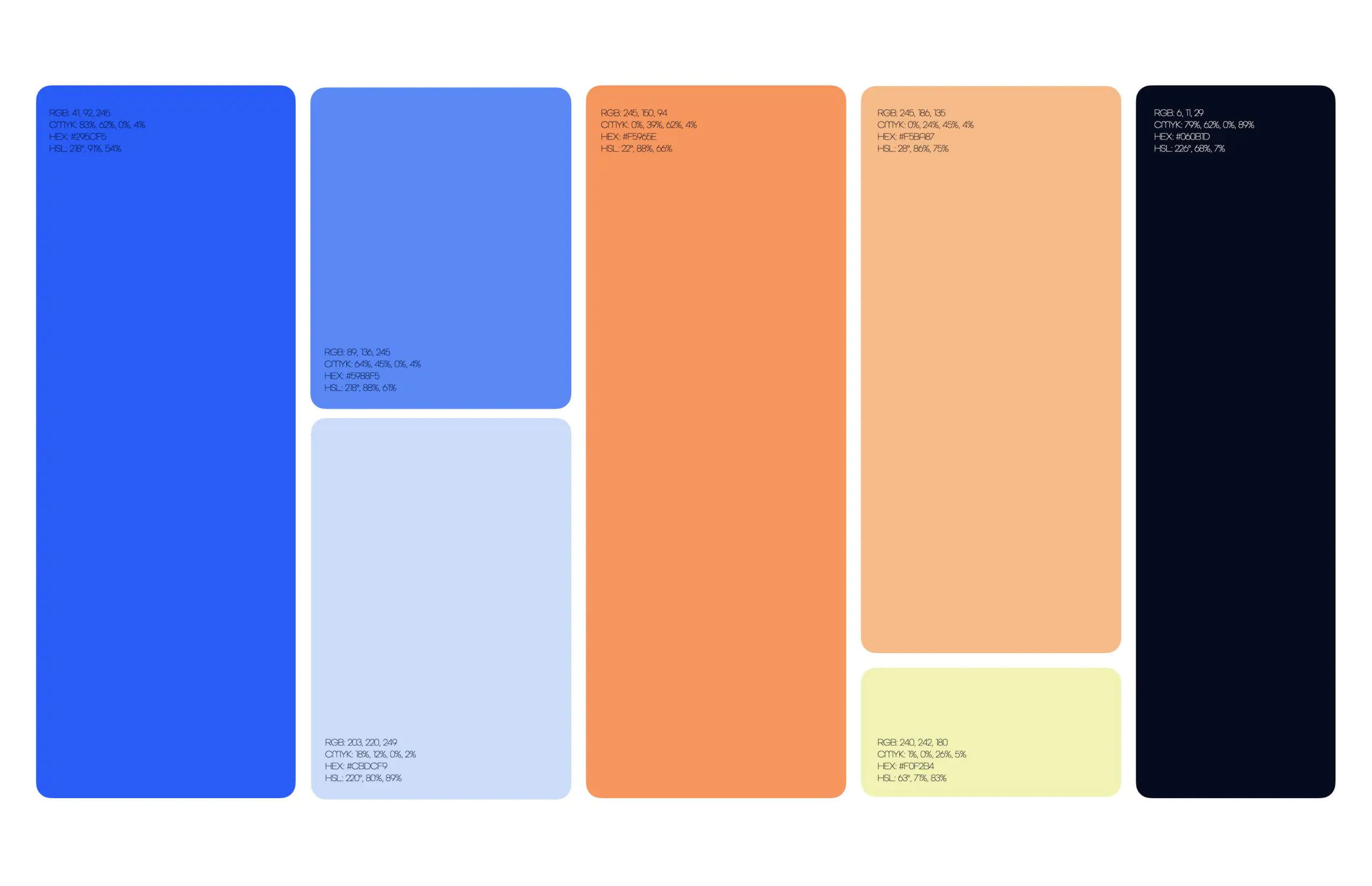
Color palette
The founders were committed to keeping blue as the core brand color—the challenge was finding the right tone. We compared the blues of global leaders like Zoom, Facebook, Philips, and IBM, and defined a unique shade that makes Dudoxx stand out.
From this base, we expanded the palette to be versatile and expressive:
- Lighter variations of blue for flexibility;
- Bold contrasting and complementary oranges;
- A distinctive yellow-green accent for freshness and personality.
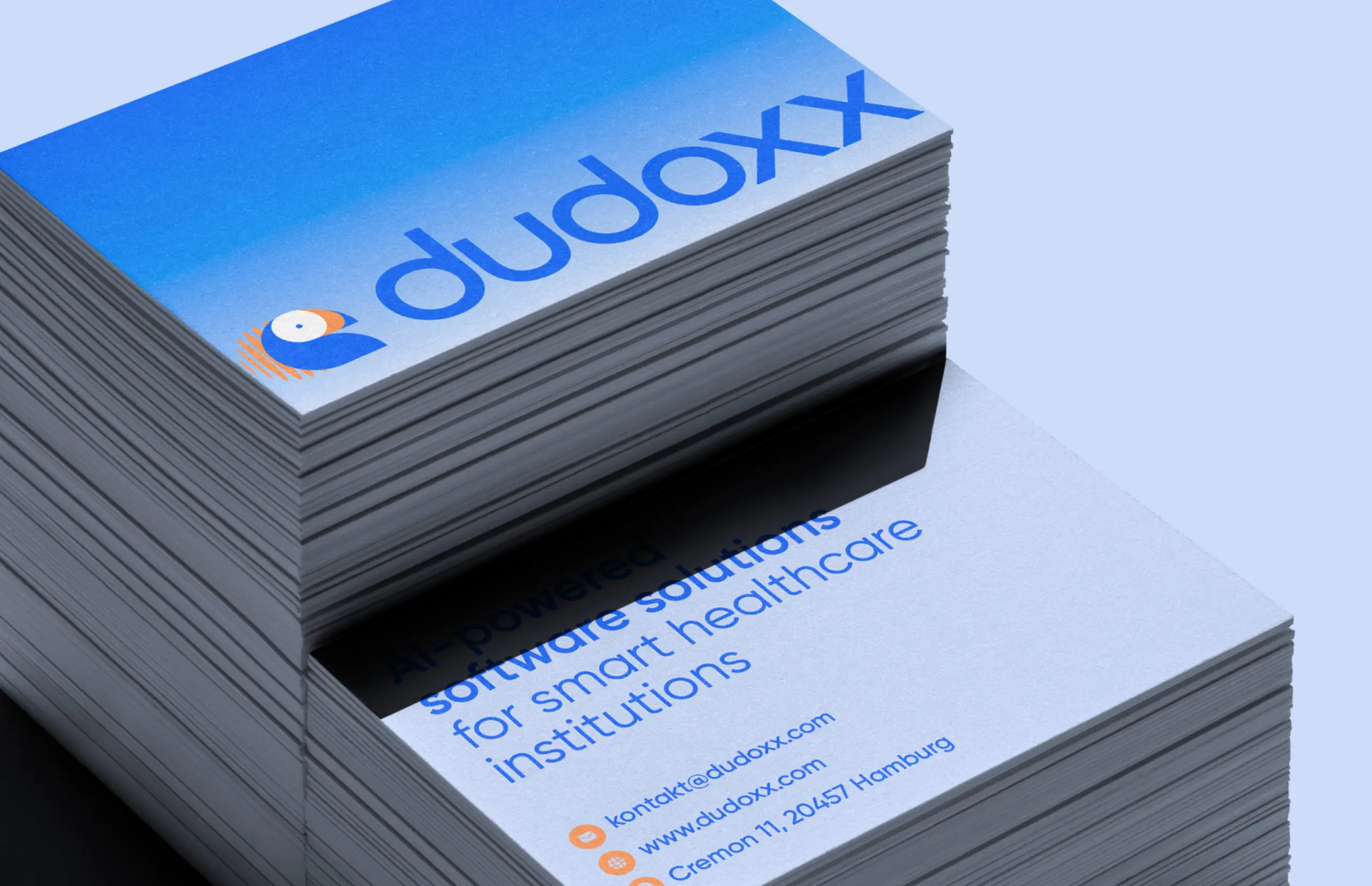
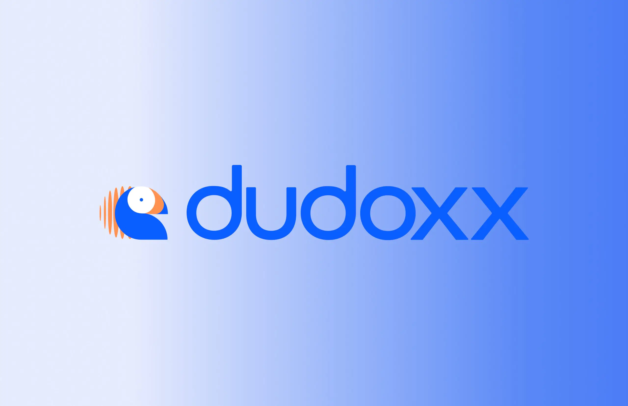
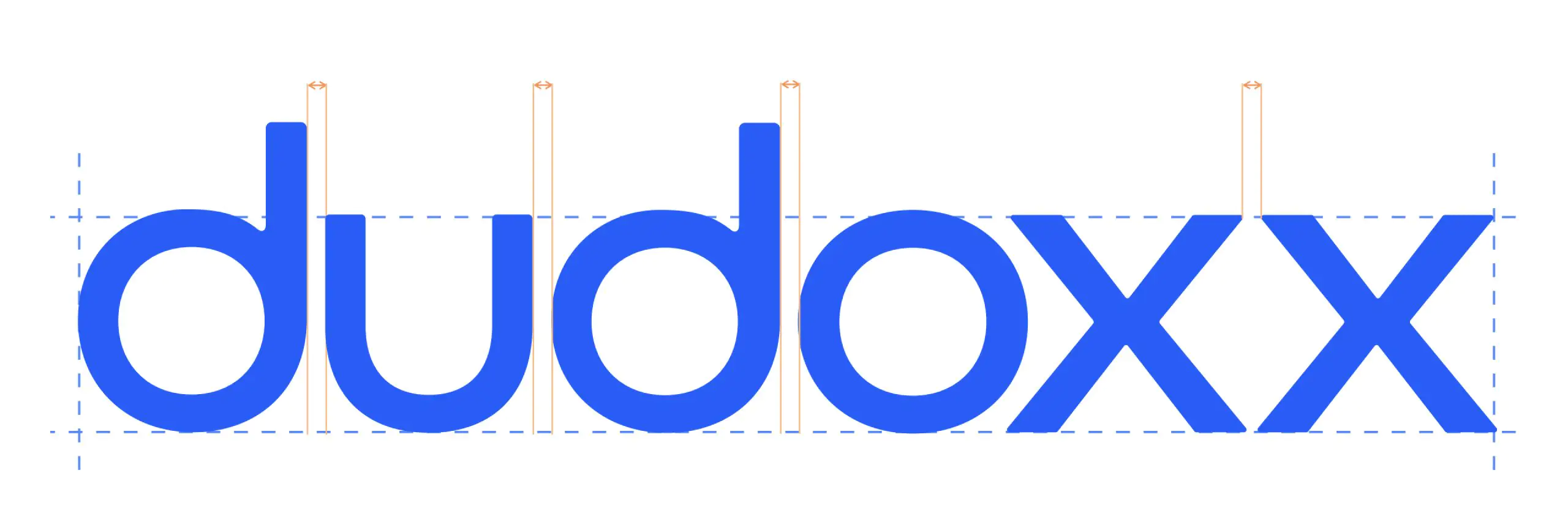
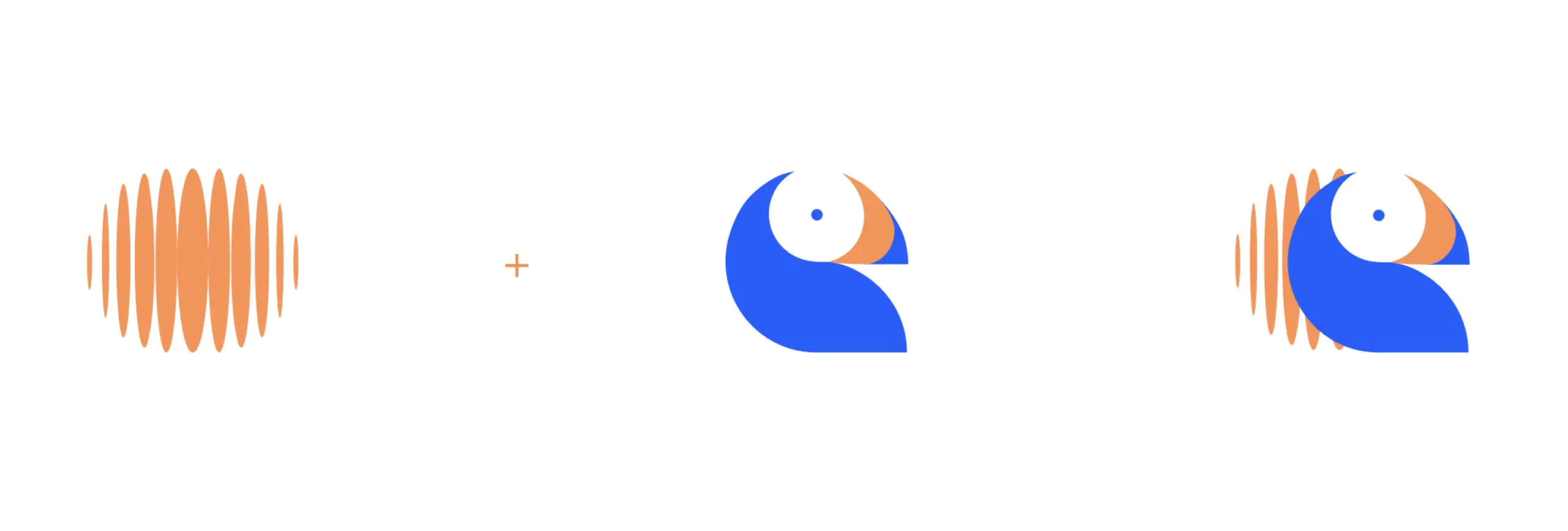
Logo
The Dudoxx logo is flexible and versatile, composed of two elements: the wordmark and the icon, each strong enough to stand on its own.
- Wordmark: A clean, balanced design that emphasizes trust and clarity. Even without the icon, it works perfectly in spaces where recognition is established or in constrained formats.
- Icon: A compact symbol combining orange audio waves with a minimal toucan. The waves highlight voice-driven technology—real-time transcription, typeless reporting, and seamless data exchange—while the toucan adds a bold, approachable personality. The icon is designed to be flexible across app icons, favicons, and responsive layouts.
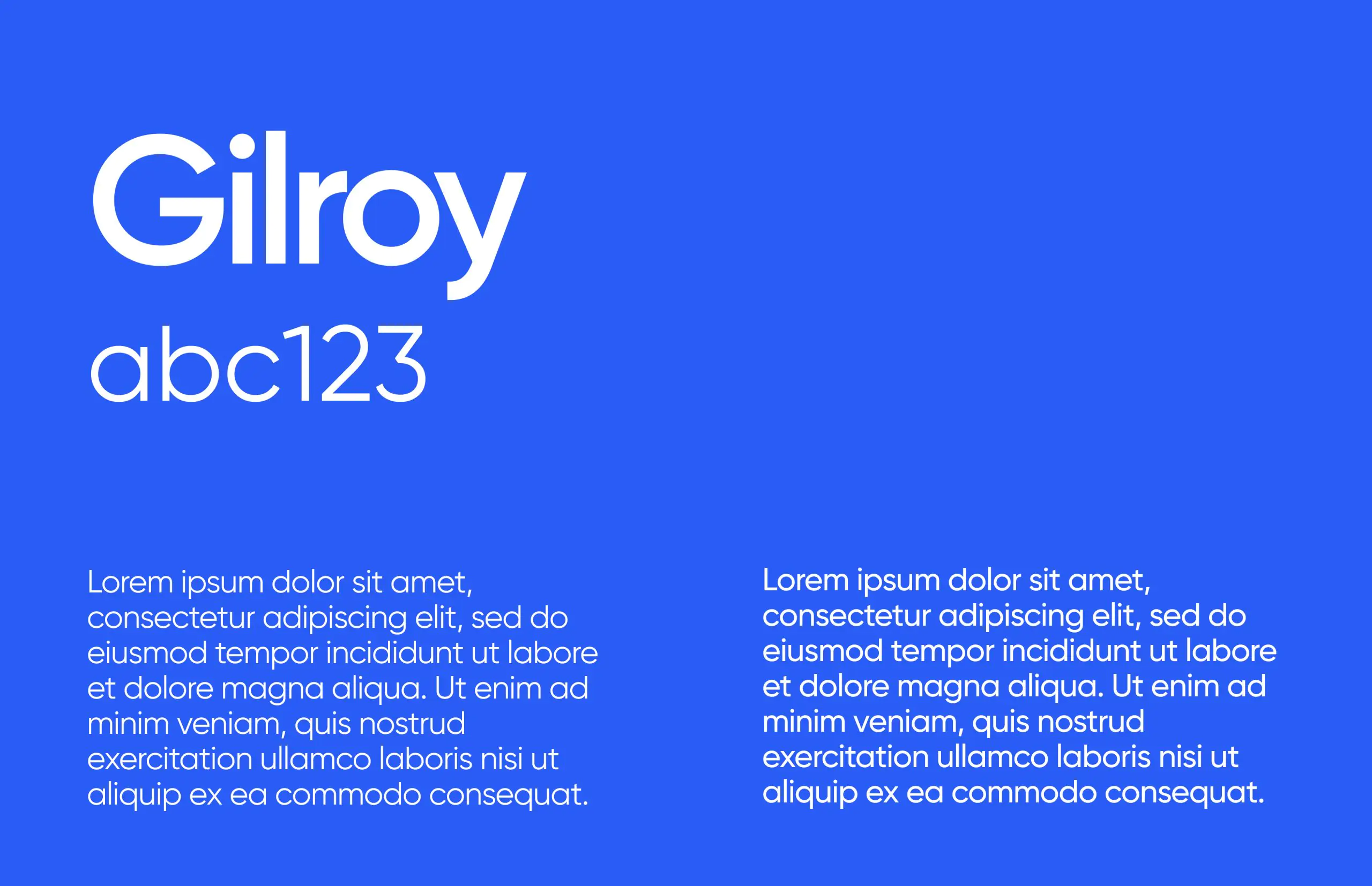
Typography
Gilroy, a geometric sans-serif with rounded shapes and a steady rhythm, reinforces a sense of harmony and friendliness while maintaining typographic strength across all platforms. Clear, modern, and professional, Gilroy supports technology-focused communications and is optimized for readability on any screen size.
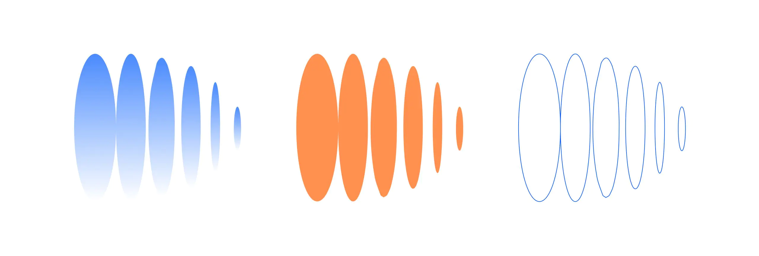
Pattern
The brand pattern draws inspiration from structured networks and intelligent systems. Its layered, fluid design echoes the waveform of the human voice, directly connecting to Dudoxx’s voice-driven technology. Used subtly, it adds depth and personality without distracting from the core message.
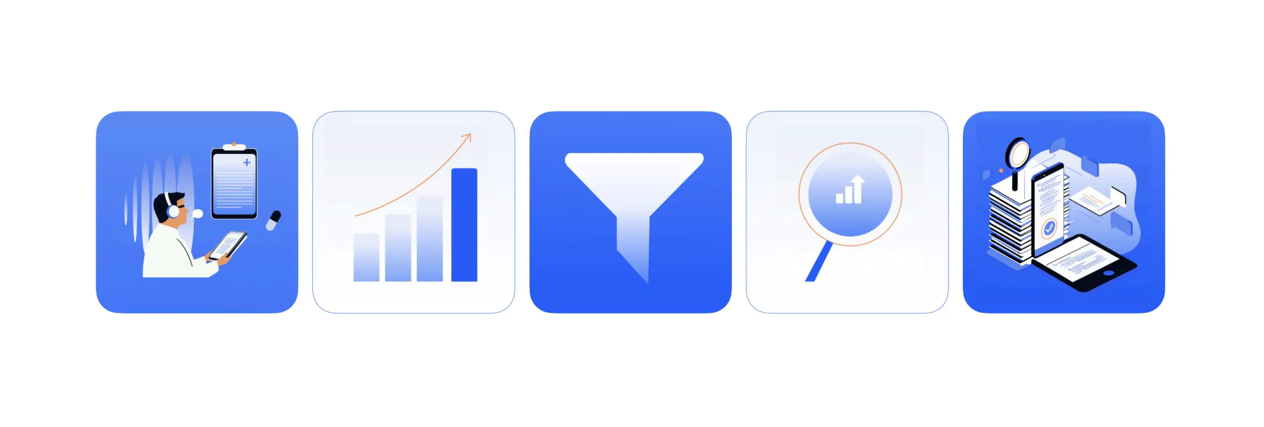
Illustrations
Illustrations feature clean lines, geometric shapes, and a restrained palette based on the brand’s core colors. The style is minimal but expressive, combining technical precision with a human touch. Each visual is designed to simplify complex ideas, making abstract systems and voice-driven technology feel intuitive, approachable, and engaging.
Templates
Social media templates follow the brand’s visual identity while accommodating campaign-specific visuals and messaging. Designed for flexibility, they work seamlessly across formats and platforms, helping Dudoxx maintain a consistent and polished presence online.
Impact
The refreshed Dudoxx identity now communicates precision, trust, and innovation across all touchpoints—from corporate materials and social media to digital platforms. It positions the brand as modern, confident, and approachable, perfectly aligned with its mission to transform digital health.