Share
Share 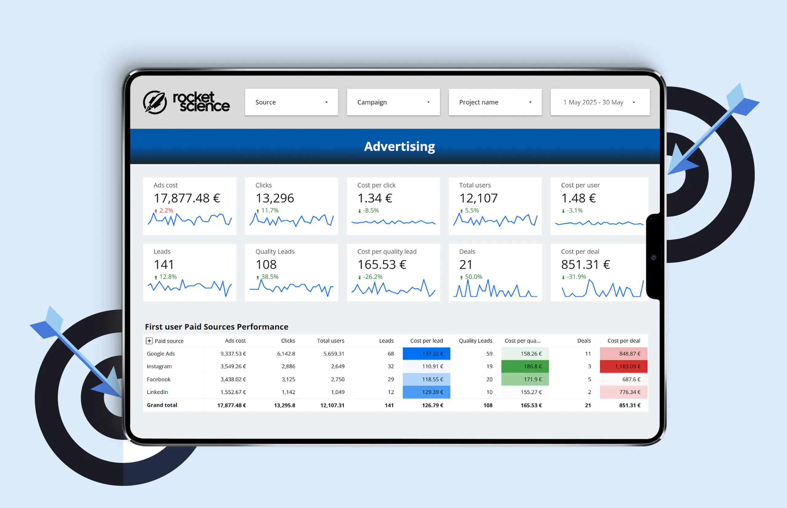
What Is a Dashboard?
If a report is a “snapshot” of your business, then a dashboard is “live video.”
It’s a panel where key metrics are gathered in one place and displayed as charts, graphs, or real-time figures that update automatically.
Dashboards serve different purposes:
- Operational—showing what’s happening right now (e.g., the status of a campaign or whether the website is performing smoothly);
- Analytical—helping spot patterns and uncover insights;
- Strategic—keeping the bigger picture visible and tracking progress toward long-term goals.
Dashboards are valuable across roles:
- Marketers use them to measure ad performance.
- Product managers track user behavior and optimize features.
- Executives rely on them to see where the business is heading.
Why Dashboards Change the Game
- Time savings. Automated data collection eliminates manual work and consolidates information into a single system.
- Customizability. Unlike built-in analytics or CRM reports, dashboards can be tailored to specific business objectives.
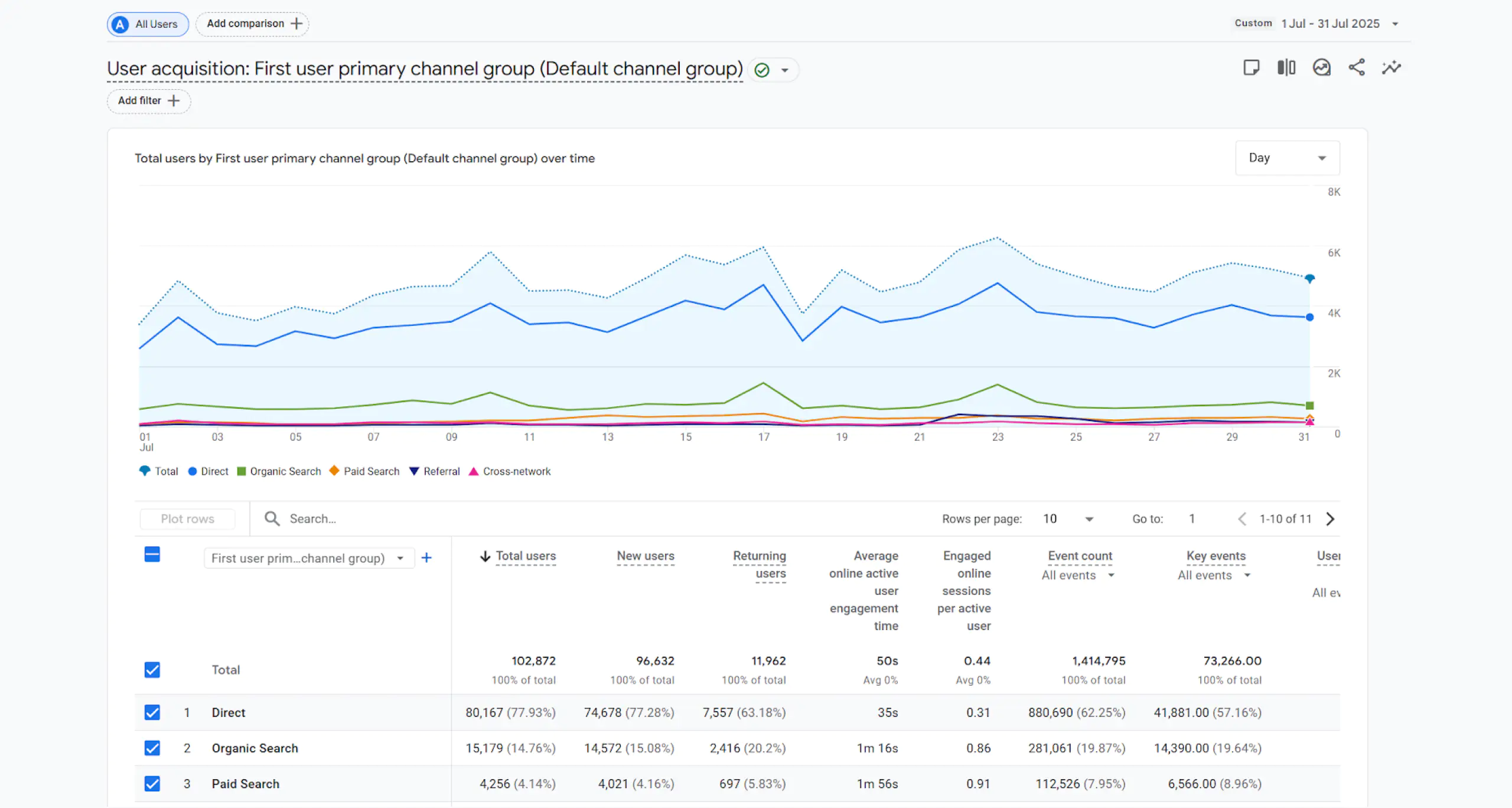
Google Analytics 4 makes it possible to build custom reports, but its flexibility has limits. For example, you can display only one type of visualization per page.
A dashboard, on the other hand, lets you surface exactly the parameters and metrics you need—and choose the visualization style that highlights what matters most.
- Transparency. Everyone in the team sees the same data, speaks the same “language,” and understands progress toward goals.
- Faster decisions. A quick glance at a chart reveals whether metrics are trending up or down—issues become visible instantly.
- Error reduction. By avoiding copy-paste and manual reporting, you minimize human mistakes.
- Focus. Out of hundreds of metrics, dashboards highlight only those that truly drive business growth.
Popular Dashboard Tools
The market offers a variety of solutions, each with unique strengths:
Google Looker Studio (formerly Data Studio)
- Free, integrates directly with Google Analytics, Ads, Sheets, and 20+ sources, plus 1,200+ partner connectors.
- Perfect for marketing teams and small businesses that value quick setup.
- ⚠️ Less suitable for large-scale data.
→ An excellent choice for companies that value simplicity and a fast start.
Power BI (Microsoft)
- A flexible, powerful tool ideal for finance and corporate analytics.
- Easily connects to Excel and SQL databases.
- ⚠️ Requires more complex setup and support.
→ Best suited for medium and large businesses within the Microsoft ecosystem.
Tableau
- A global leader in BI, renowned for advanced visualization capabilities.
- Designed for big data analysis.
- ⚠️ Comes with a higher licensing cost.
→ Widely adopted by enterprises where analytics is mission-critical.
How to Implement Dashboards Effectively
- Start with the essentials: define the key questions and metrics that truly drive your business.
- Select the most suitable dashboard tool.
- Connect your primary data sources (CRM, ad platforms, web analytics).
- Design an intuitive, user-friendly interface.
- Foster a culture of dashboard use within your company.
- Continuously update metrics and visualizations as business needs evolve.
For many clients, we at ROCKETSCIENCE start small—with a minimal request and a Looker Studio prototype—and then iterate together. Typically, the process looks like this:
- Define the list of data sources that need to be connected (Google Analytics 4, Google Ads, Meta Ads, Search Console, Hubspot, etc.).
- Integrate them into Looker Studio directly or via third-party connectors.
- Create the initial version of the dashboard in Looker Studio with the key metrics we consider significant for analysis.
- Present the ready version to the client, explain what data is displayed, and discuss adjustments together.
- Make the necessary changes at the client’s request.
- Conduct a team presentation: demonstrate how to use the dashboard and highlight the most important insights.
At this stage, the dashboard is already delivering value: scattered data is consolidated into a single picture, the target audience of the business becomes clear, and it is easier to understand what truly engages them.
As a rule, a Looker Studio dashboard is part of a larger analytics project. In such cases, Google Analytics 4 already has a comprehensive set of events and parameters configured to describe user behavior on the website. We take these into account in reporting and display them on screen in a convenient format.
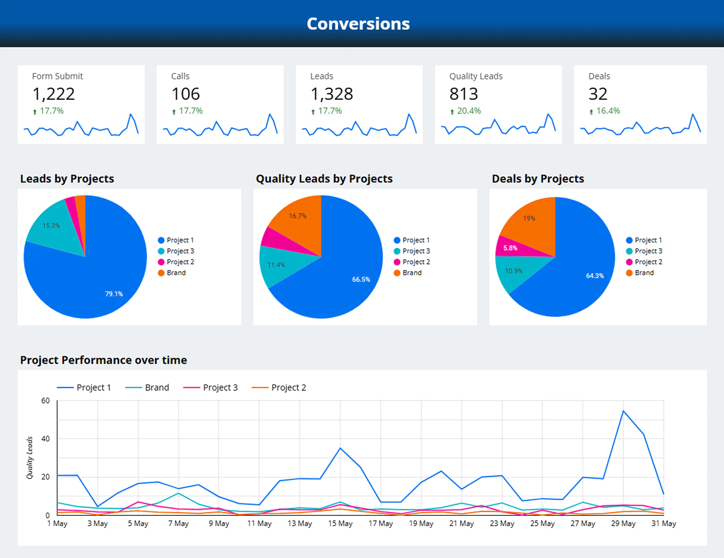
Examples of metrics we include in a dashboard:
- Call-to-action button texts and the number of clicks on them;
- Form headlines and submission counts;
- FAQ questions and the number of times users expand them;
- Homepage scroll depth (25%, 50%, 75%, 90%, and 100%).
This data makes it possible to evaluate which site elements perform most effectively, which changes genuinely increase user engagement, and how high-quality the incoming traffic is overall.
A few words in the end
Dashboards aren’t just eye-catching charts—they’re powerful management tools that turn raw numbers into real business intelligence. Instead of guessing, leaders can see the full picture, make decisions with speed, and build strategies grounded in data, not assumptions.
As the volume of information grows by the day, success belongs to the companies that know how to cut through the noise and focus on what truly matters. Dashboards make that clarity possible.If your data feels scattered and opaque, now is the moment to bring order and transparency.
At ROCKETSCIENCE, we help businesses move from chaos to clarity: setting up seamless data collection, visualizing key metrics, and ensuring that every number works to your advantage. Let automation handle the routine—so you can focus on making faster, smarter, and more confident decisions.