Mego is one of the leading Latvian retailers with over 20 years of experience. They offer a wide range of quality products from local producers. With a network of 90+ stores, Mego is a familiar and trusted name in Latvia.
Objective
We aimed to modernize the design system while preserving the core logo and recognizable elements.
The updated style should be clear, simple, and memorable, ensuring a cohesive brand experience across all touchpoints.
Additionally, we redesigned the company’s social media presence and official website within the framework of the new brand identity.
Logo
Mego’s original logo featured a round shape in yellow against a dark blue background. We observed that the original Mego logo featured a circular shape and interconnected symbols arranged in a harmonious rhythm.
This design element served as the foundation for developing the broader Mego design system.
Logo usage
We proposed introducing new color variations while adhering to the two-color rule. This approach would enhance the logo’s versatility and allow for broader applications across various marketing materials.
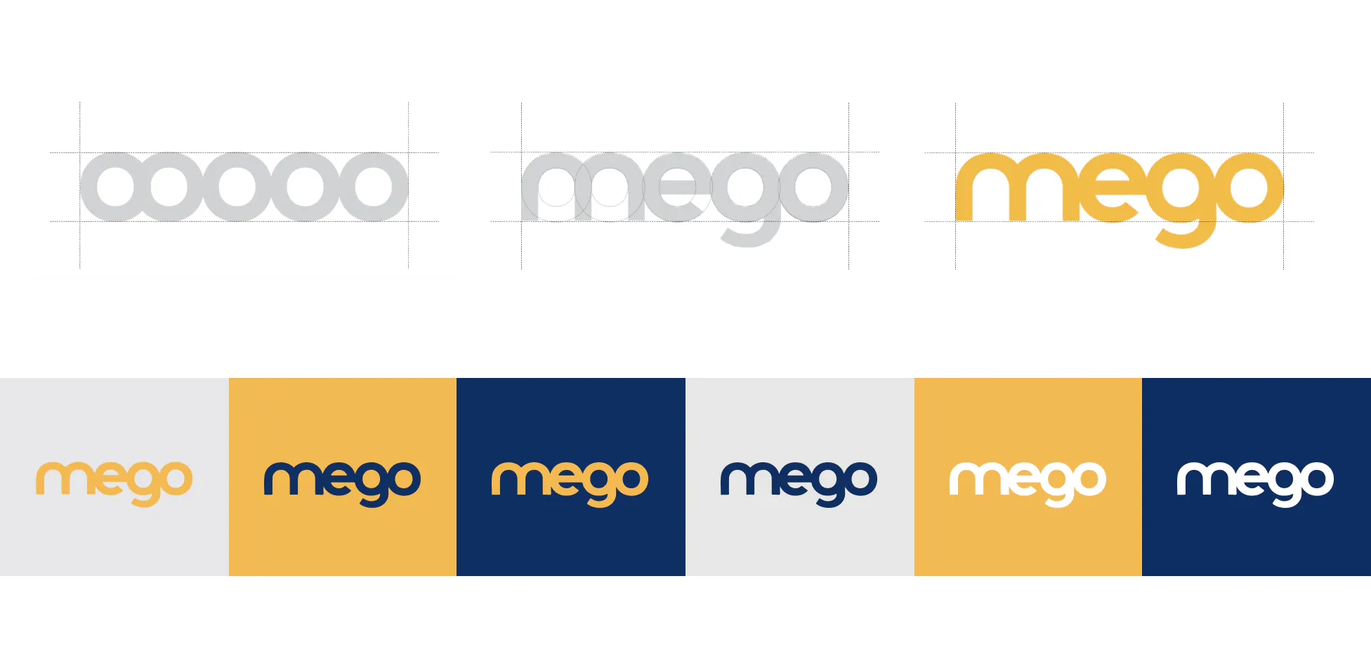
Colors
While the original Mego brand identity featured a limited palette of yellow and blue, we expanded the color scheme to include white, black, and gray. This expanded palette offers greater versatility for creating advertising materials, web formats, and graphic elements.
For a visually impactful design, we recommend using yellow, blue, and white as the base colors. Add contrasting text blocks and images to create a dynamic and engaging composition.

Typography
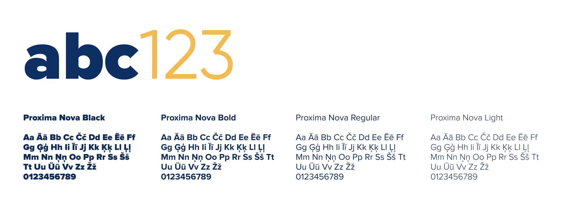
Proxima Nova is the primary font for creating all advertising offers. Headings and highlights are in Black typeface, while regular text uses the Thin typeface. Character spacing is -5%.
Pattern
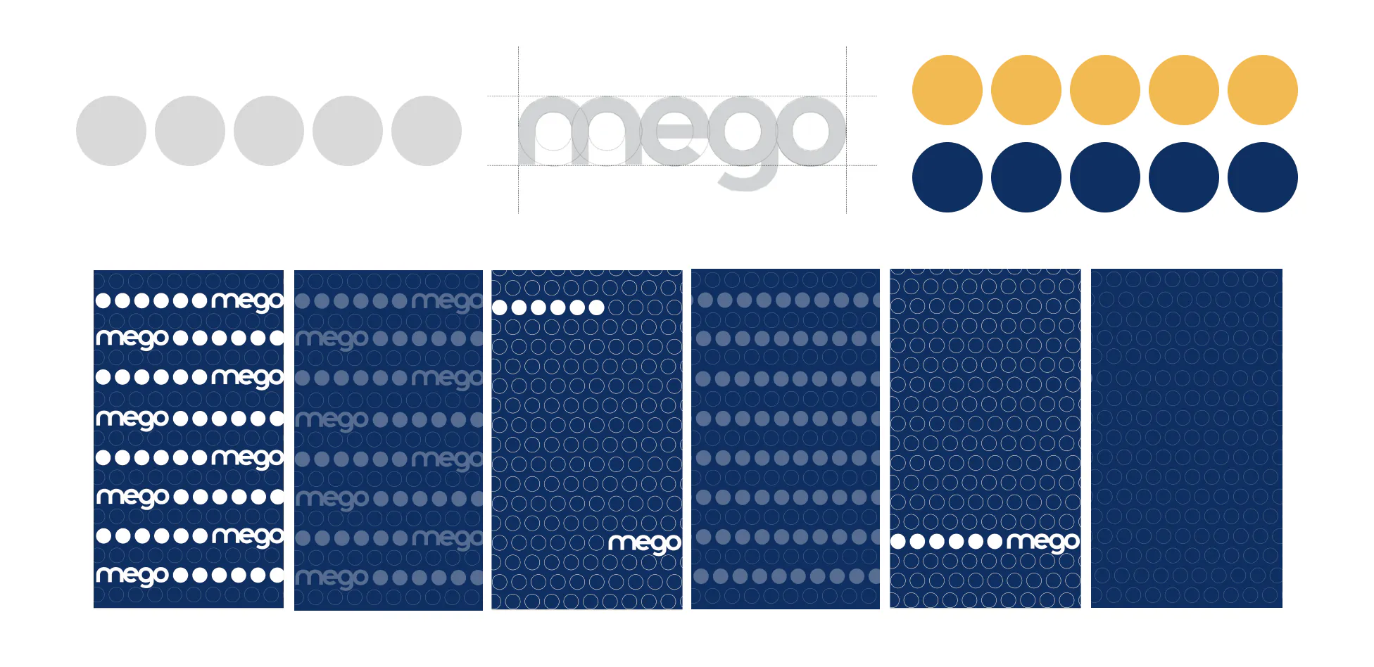
The Mego logo’s circular shape serves as the foundation for the overall design system. We recommend using monochrome color variations to ensure consistency and versatility.
The logo can be seamlessly integrated into repeating patterns, creating a visually engaging and cohesive composition. When incorporating text, align the first letter’s height with the circle’s diameter and center the text within the pattern.
This approach ensures a harmonious and balanced design.
Illustrations
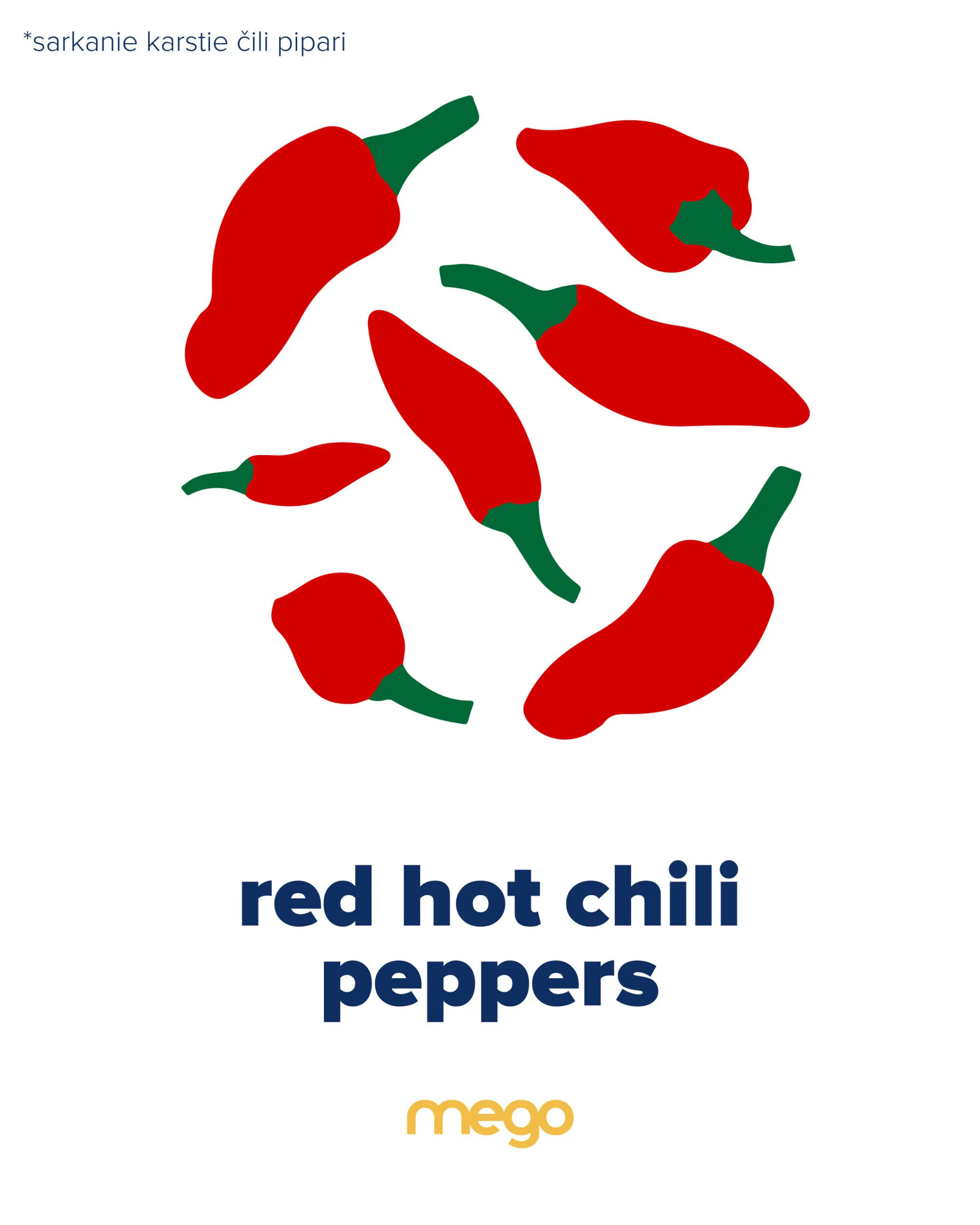
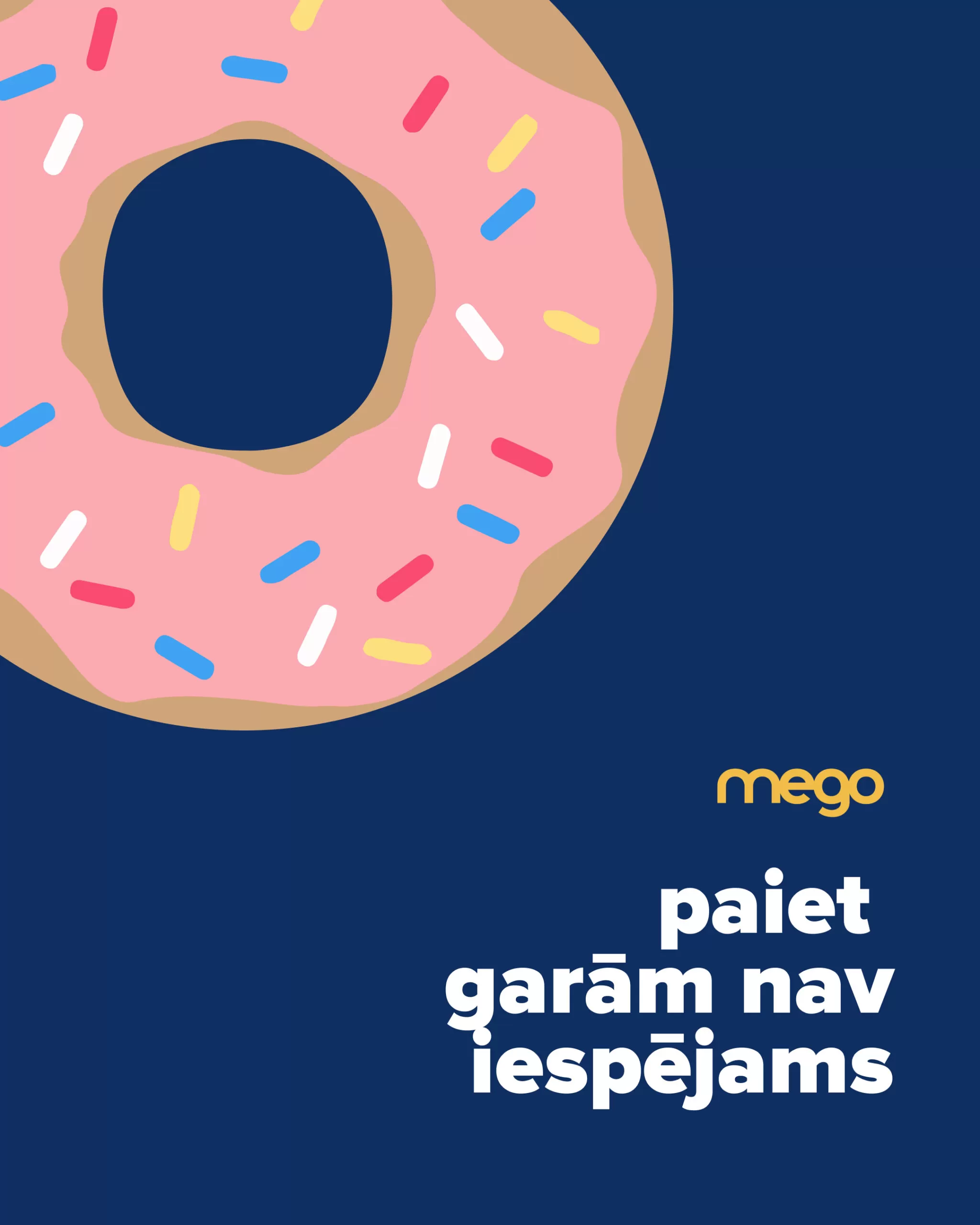
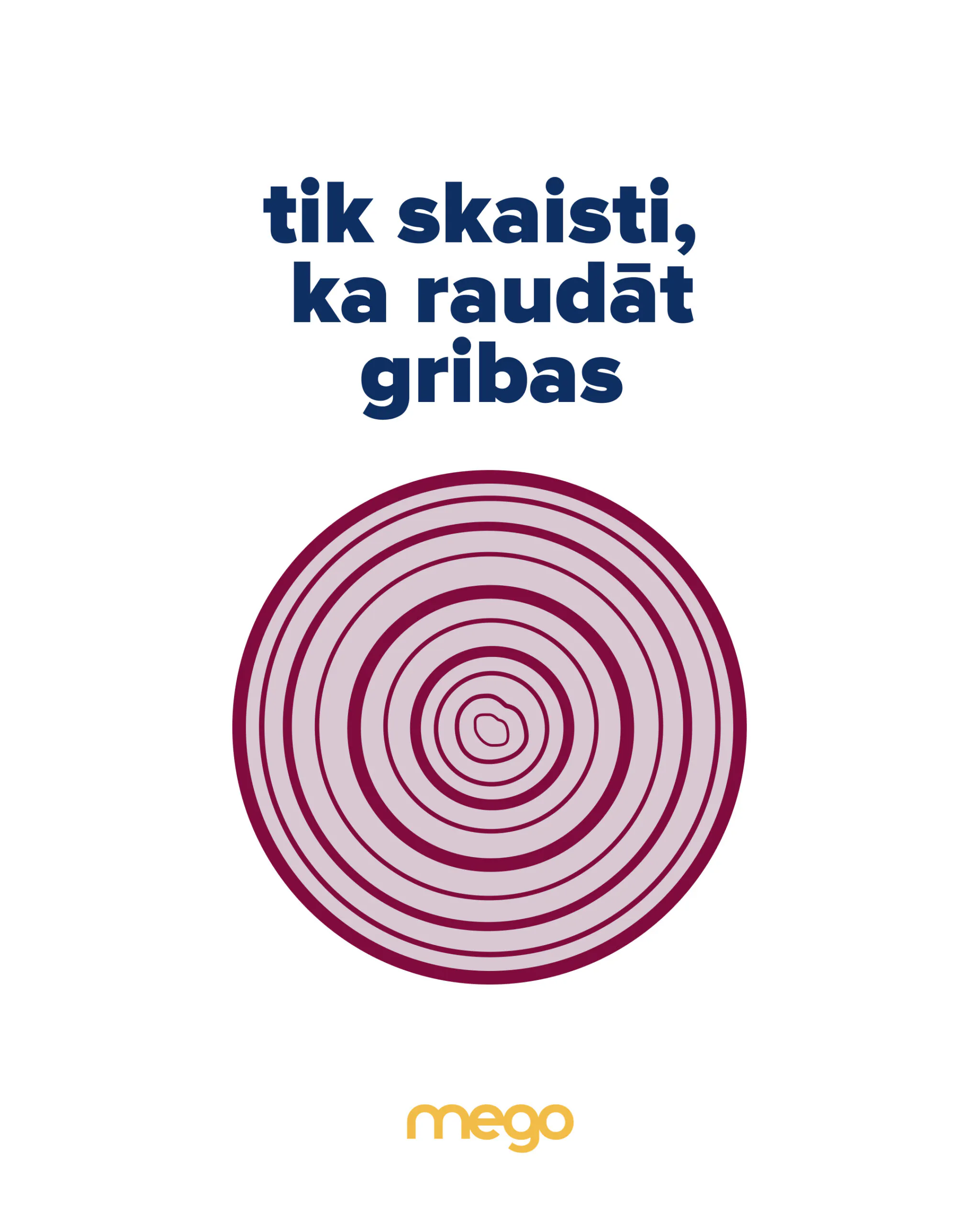
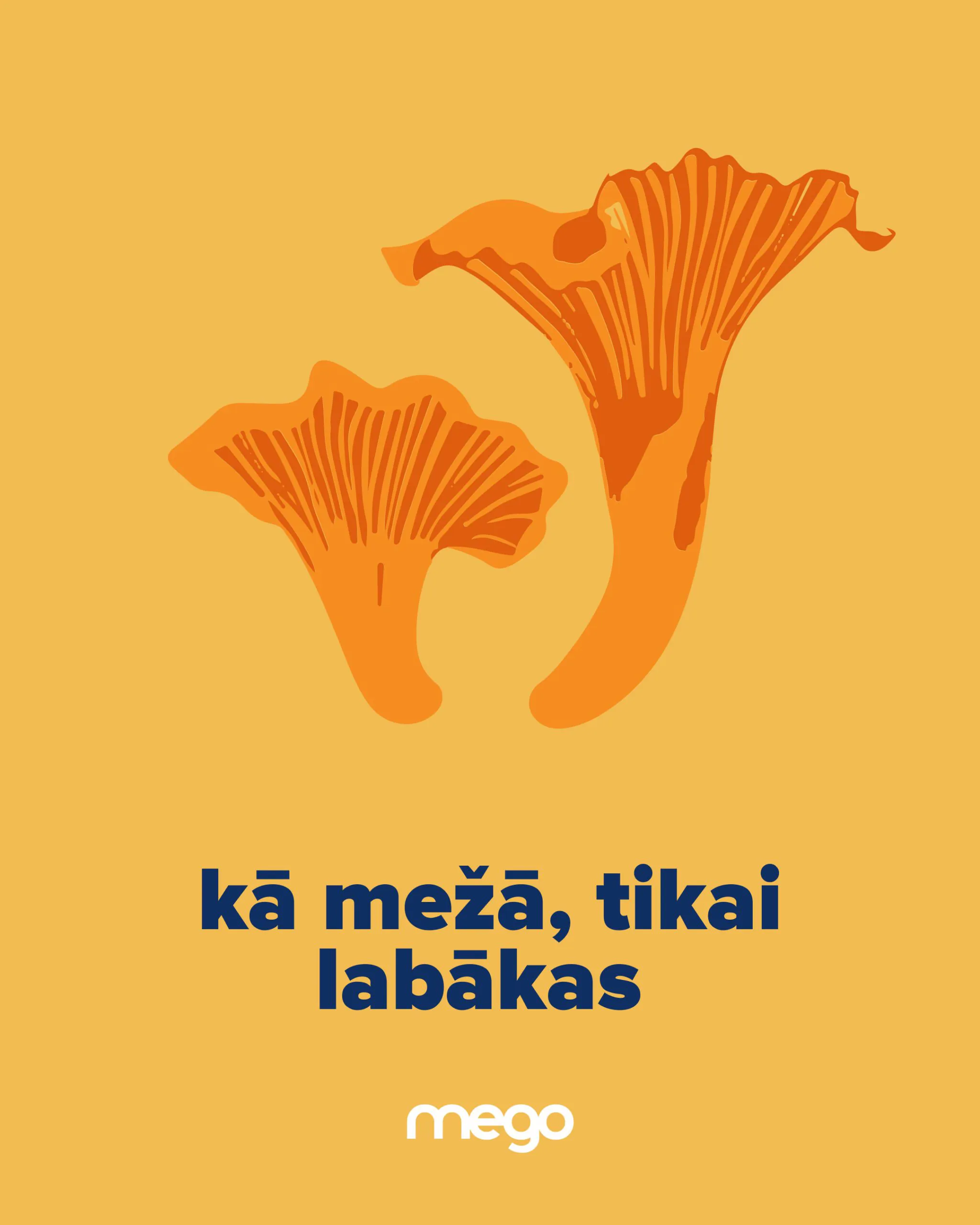
We developed a series of flat illustrations to complement the Mego brand identity. These versatile illustrations can be used in various marketing materials, including advertising and social media.
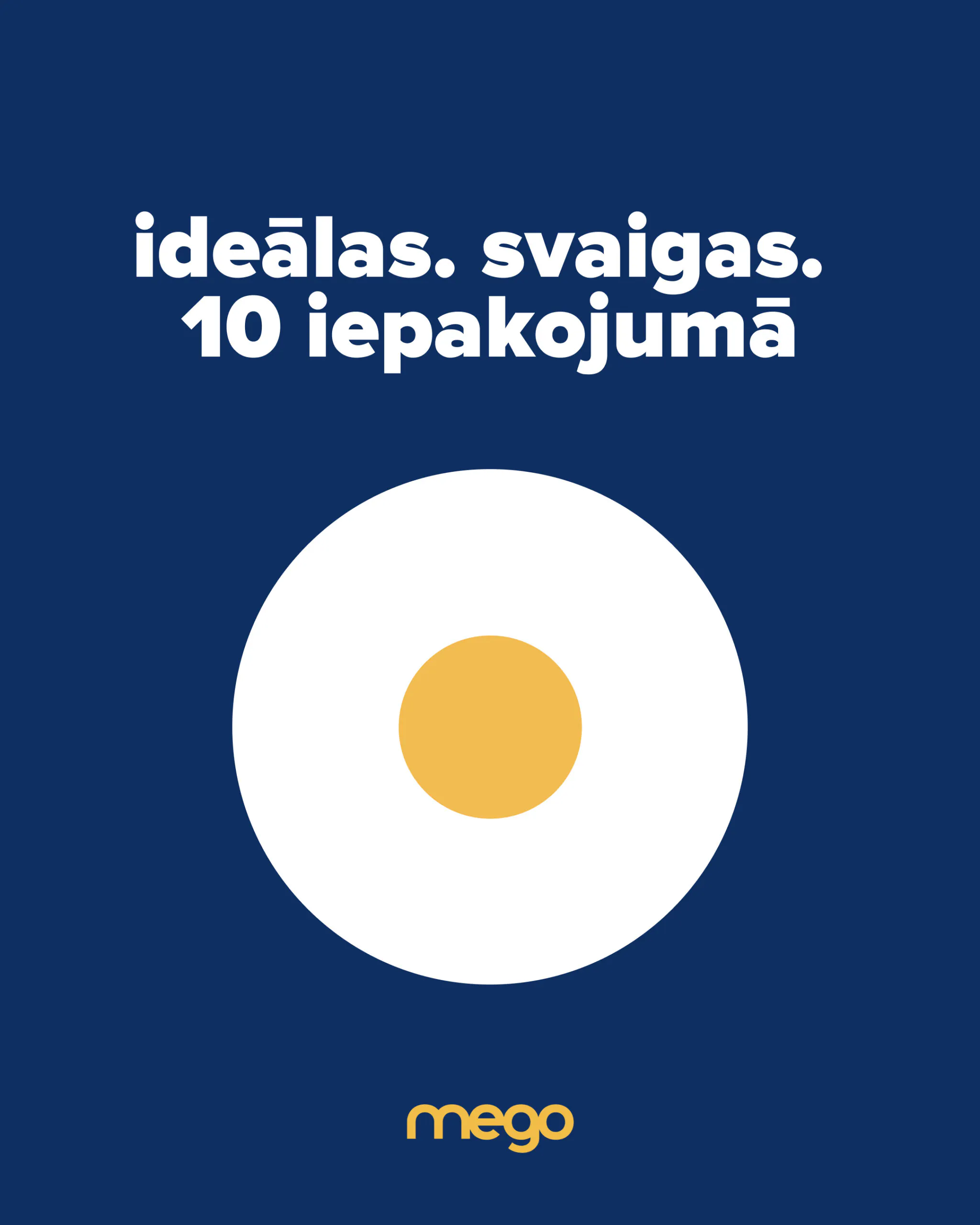
We integrated a variety of products into the circular shape, showcasing items like eggs, shrimp, garlic, and pasta.
For a clean and impactful look, place these illustrations on plain backgrounds like white, blue, or yellow.
Some products were illustrated separately in the same style, offering additional design options.
Graphic elements
To highlight key phrases and draw attention to specific information, we incorporated linear graphic elements. These elements combine the company’s signature yellow and blue colors, adding a dynamic and engaging touch to the text.
The simplicity and lightness of these elements create a visually appealing and impactful composition.

Photo style
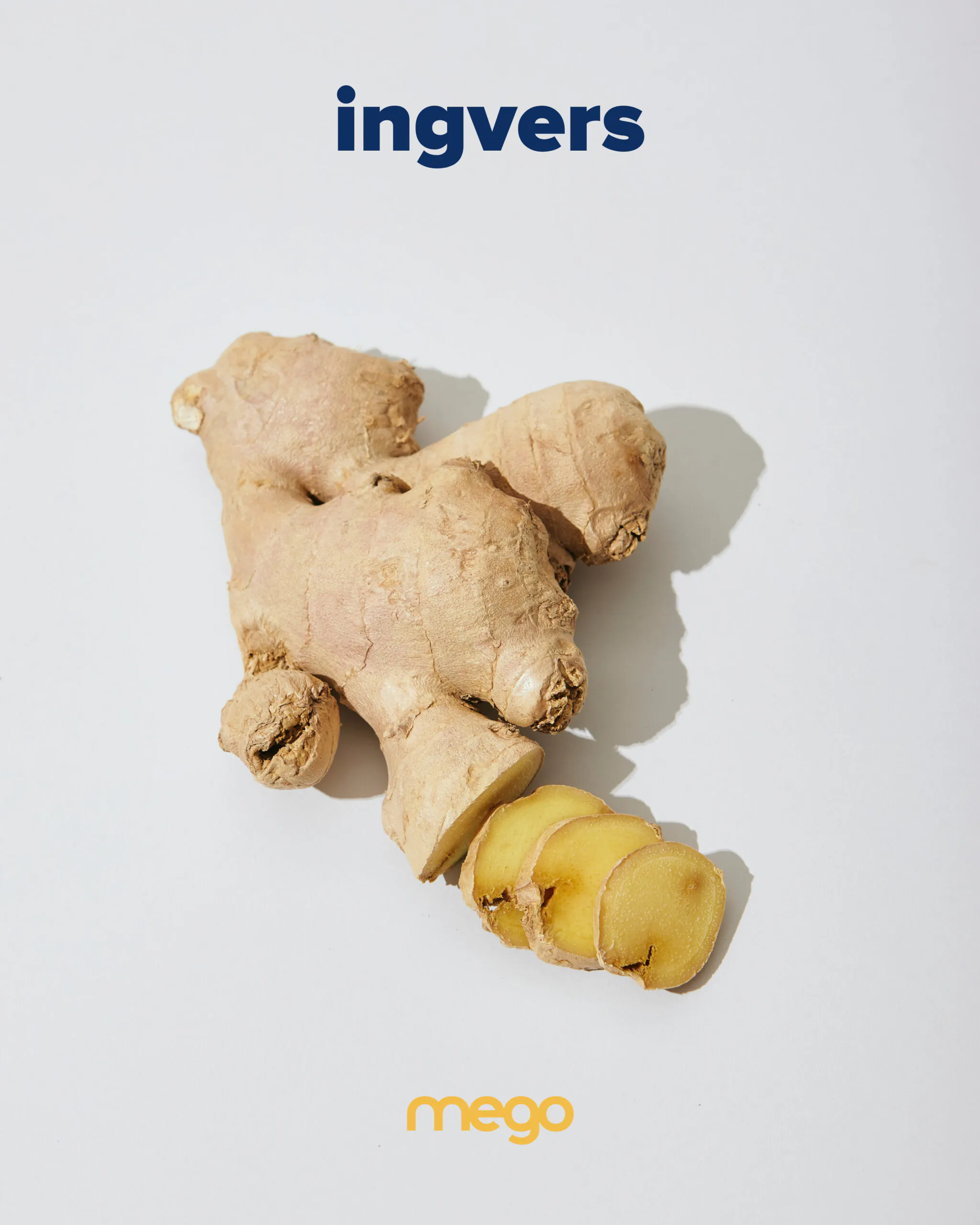
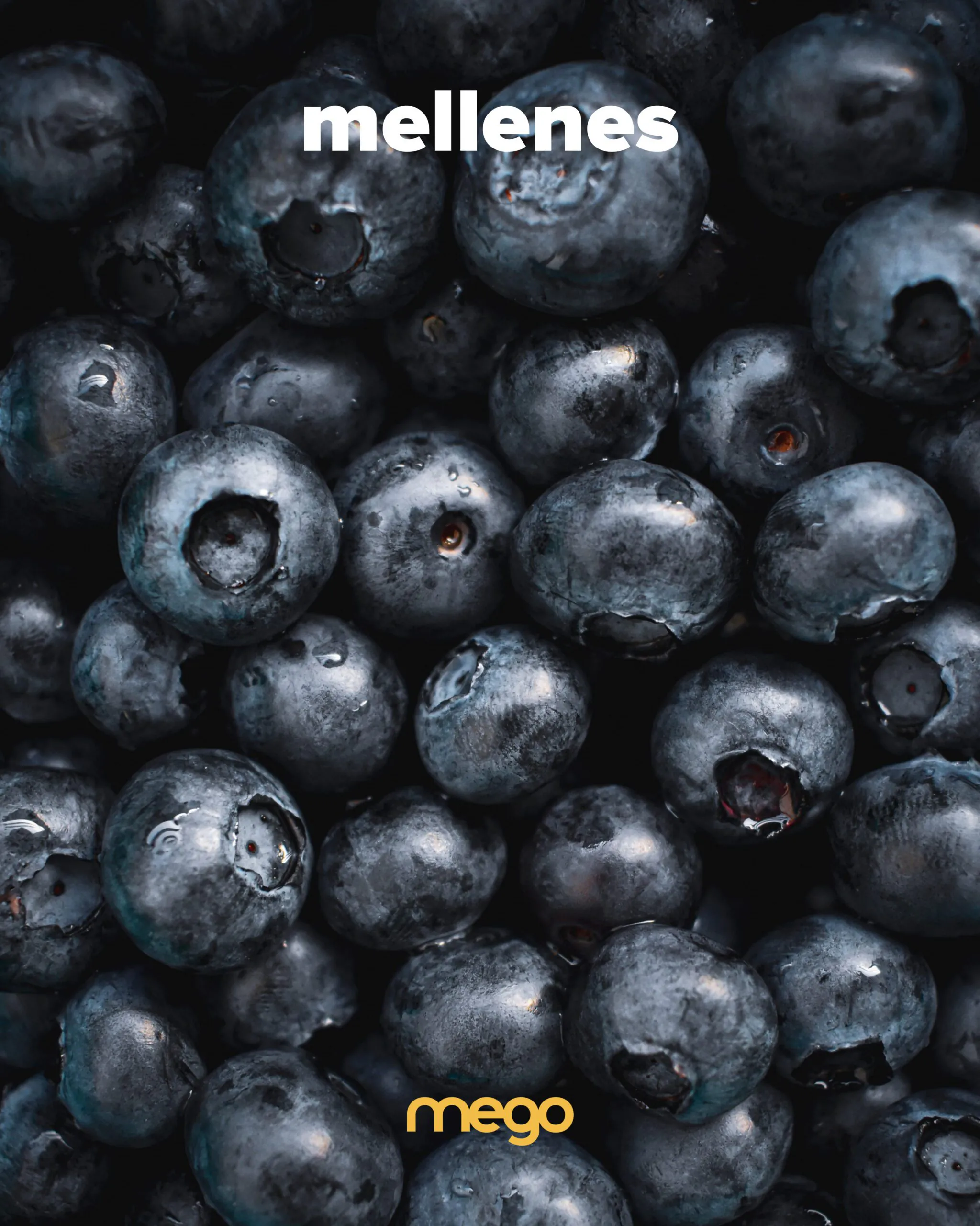
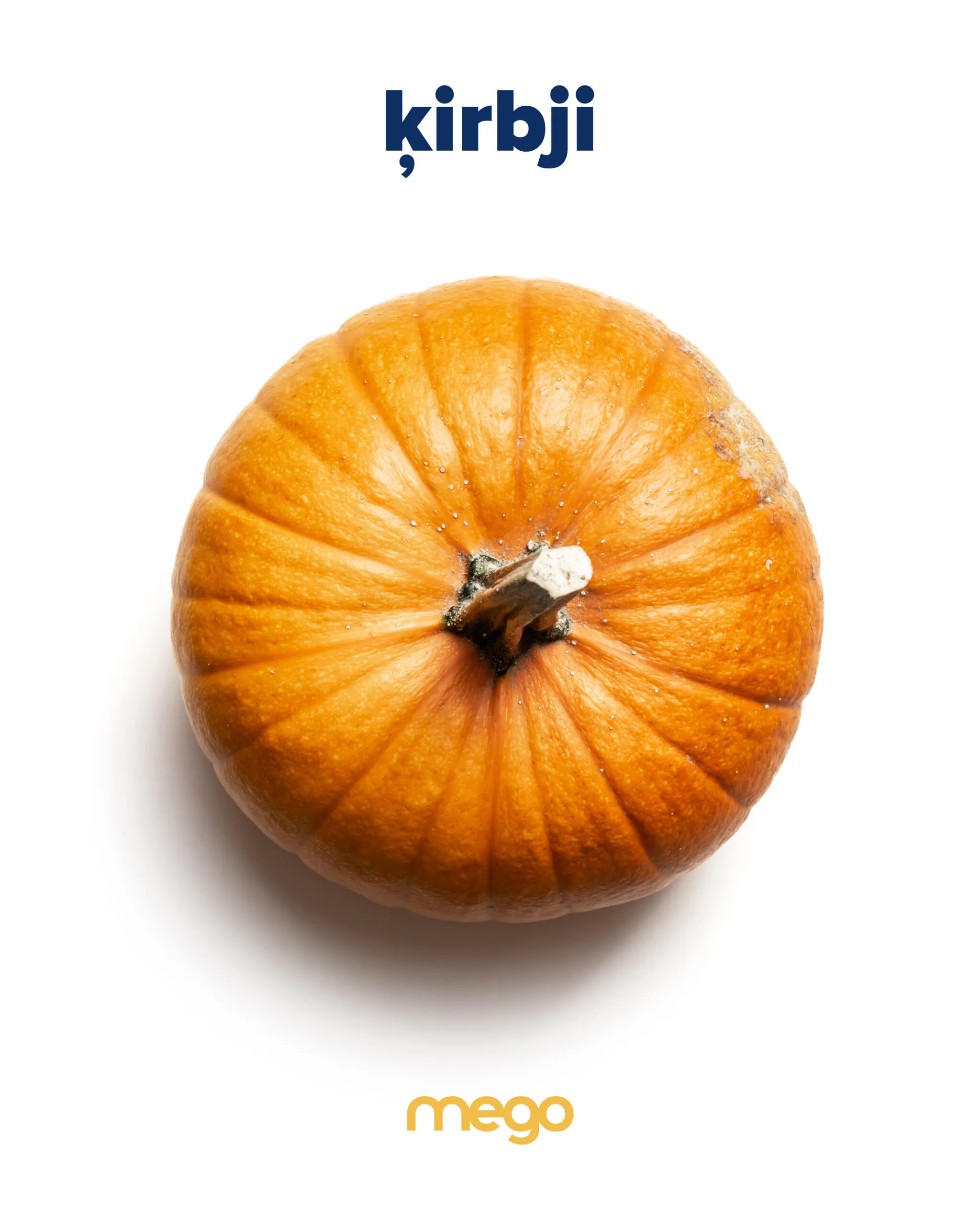
For advertising materials and social media, opt for contrasting shots with deep exposure. This creates visually striking images that capture attention.
It is important to showcase the products in their natural state, highlighting their freshness, juiciness, and quality. Avoid cluttering the images with unnecessary elements. Let the products speak for themselves.
Social media design
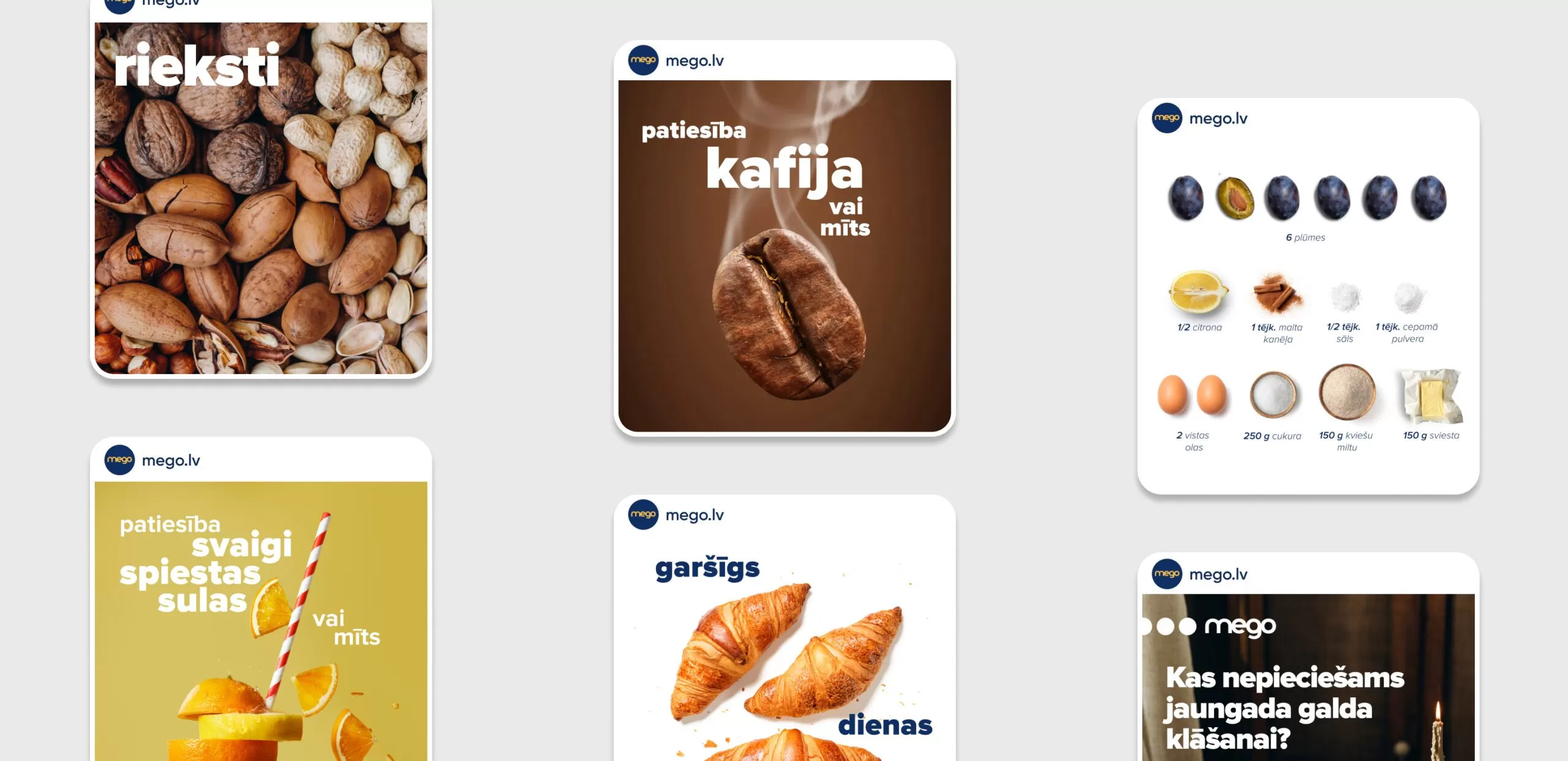
Drawing inspiration from the updated brand identity, we designed Mego’s social media (Instagram and Facebook).
We created new rubrics for both Instagram and Facebook, and developed visually appealing templates for them.
We also designed engaging templates for Instagram Stories and unique linear illustrations for highlight covers.
Web design
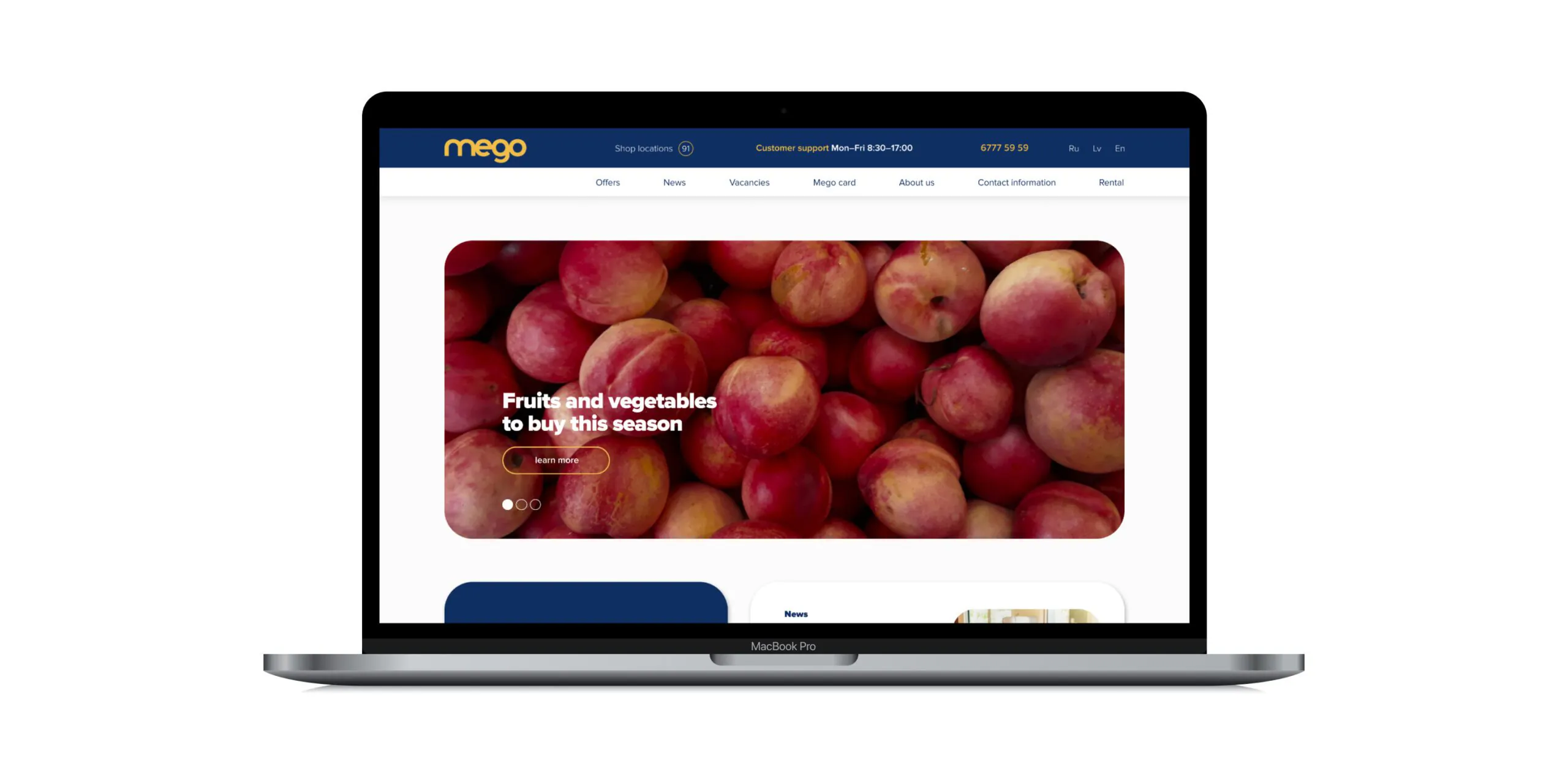
The next phase of the brand identity update involved redesigning the Mego website. While the website’s architecture remained unchanged, we focused on enhancing its visual appeal and aligning it with the new design system.
We adopted a boxed approach, framing each content block within rounded edges. This created a visually organized and user-friendly layout.
The redesigned website seamlessly integrated with Mego’s other digital platforms, offering a more cohesive and visually appealing experience. The site also gained a sense of lightness and functionality, enhancing its overall usability.
Team working on the project:
Ilona Kardanova — Art Director
Tina Alieva — Graphic designer


 Return
  Share
Share 


